El LG gram Style es el portátil más ligero del mercado, con solo 999g de peso y una batería que dura hasta 12.5 horas. ¡Perfecto para llevar a todas partes!
Disfruta de una nueva pantalla de 35,56cm (14") con tratamiento antirreflejos y formato 16:10. Además, cuenta con un panel OLED WQXGA+ (2880 x 1800px) que mejora el rango de color hasta un 100% del DCI-P3 y una tasa de refresco de hasta 90Hz. ¡Imágenes nítidas y vibrantes garantizadas!
El chasis del LG gram Style está fabricado con magnesio y nanocarbono, lo que le otorga una gran resistencia. De hecho, ha superado 7 pruebas del estándar militar STD-MIL-810H. ¡Un portátil duradero y confiable!
Cuenta con una memoria RAM ultrarrápida LPDDR5x de 32GB integrada en placa y un disco duro SSD de 512GB NVMe de 4ª Generación. Además, tiene una gráfica Iris Xe que te permitirá trabajar con contenido 4K UHD con máxima fluidez. ¡Potencia y rendimiento en un solo dispositivo!
Con tan solo 15,9mm de grosor, el LG gram Style ofrece una conectividad universal. Cuenta con 1 x USB 3.2, 2 x USB Tipo C con Thunderbolt 4 integrado que permite carga ultrarrápida, entrada de auriculares y ranura para tarjetas UFS/Micro-SD 3.0. ¡Todo lo que necesitas en un solo lugar!


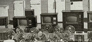
1958 - Establece Gold Star (ahora LG Electronics)
1959 - Produce la primera radio de Corea
1965 - Produce el primer refrigerador de Corea
1966 - Produce el primer televisor de Corea
1978 - Logra USD 100 Millones en exportaciones
1982 - Establece la primera base de producción en el extranjero en los EE.UU.
1995 - Cambia el nombre de la empresa a LG Electronics

1999 - Entra en una empresa conjunta para desarrollar paneles LCD
2005 - Toma la delantera en el mercado de lavado de bidones de EE.UU.
2008 - Desarrolla el primer chip de módem móvil LTE
2009 - Se convierte en la segunda marca de televisores LCD

2011 - Lanza televisores 3D con lentes obturadores
2012 - Primeros en el mundo en comercializar televisores ULTRA HD de 84 pulgadas
2013 - Presenta el servicio HomeChat para electrodomésticos inteligentes, lanza Vehicle Components Company
2014 - Presenta el primer televisor OLED 4K y el televisor inteligente webOS, presenta el teléfono inteligente G3 con pantalla Quad HD

2016 - Presenta la marca premium LG SIGNATURE
2018 - Presenta los robots comerciales CLOi
2020 - Lanza el primer televisor OLED enrollable
2022 - LG Smart Park es seleccionada como Fábrica Faro por el Foro Económico Mundial (FEM)


En BiTech, ofrecemos , 30 días de Devolución GRATUITA, para que puedas comprar con total tranquilidad. Si no estás satisfecho te devolvemos el dinero. A parte, tienes 3 años de garantía.
Más información
El LG gram Style es el portátil más ligero del mercado, con solo 999g de peso y una batería que dura hasta 12.5 horas. ¡Perfecto para llevar a todas partes!
Disfruta de una nueva pantalla de 35,56cm (14") con tratamiento antirreflejos y formato 16:10. Además, cuenta con un panel OLED WQXGA+ (2880 x 1800px) que mejora el rango de color hasta un 100% del DCI-P3 y una tasa de refresco de hasta 90Hz. ¡Imágenes nítidas y vibrantes garantizadas!
El chasis del LG gram Style está fabricado con magnesio y nanocarbono, lo que le otorga una gran resistencia. De hecho, ha superado 7 pruebas del estándar militar STD-MIL-810H. ¡Un portátil duradero y confiable!
Cuenta con una memoria RAM ultrarrápida LPDDR5x de 32GB integrada en placa y un disco duro SSD de 512GB NVMe de 4ª Generación. Además, tiene una gráfica Iris Xe que te permitirá trabajar con contenido 4K UHD con máxima fluidez. ¡Potencia y rendimiento en un solo dispositivo!
Con tan solo 15,9mm de grosor, el LG gram Style ofrece una conectividad universal. Cuenta con 1 x USB 3.2, 2 x USB Tipo C con Thunderbolt 4 integrado que permite carga ultrarrápida, entrada de auriculares y ranura para tarjetas UFS/Micro-SD 3.0. ¡Todo lo que necesitas en un solo lugar!
1958 - Establece Gold Star (ahora LG Electronics)
1959 - Produce la primera radio de Corea
1965 - Produce el primer refrigerador de Corea
1966 - Produce el primer televisor de Corea
1978 - Logra USD 100 Millones en exportaciones
1982 - Establece la primera base de producción en el extranjero en los EE.UU.
1995 - Cambia el nombre de la empresa a LG Electronics
1999 - Entra en una empresa conjunta para desarrollar paneles LCD
2005 - Toma la delantera en el mercado de lavado de bidones de EE.UU.
2008 - Desarrolla el primer chip de módem móvil LTE
2009 - Se convierte en la segunda marca de televisores LCD
2011 - Lanza televisores 3D con lentes obturadores
2012 - Primeros en el mundo en comercializar televisores ULTRA HD de 84 pulgadas
2013 - Presenta el servicio HomeChat para electrodomésticos inteligentes, lanza Vehicle Components Company
2014 - Presenta el primer televisor OLED 4K y el televisor inteligente webOS, presenta el teléfono inteligente G3 con pantalla Quad HD
2016 - Presenta la marca premium LG SIGNATURE
2018 - Presenta los robots comerciales CLOi
2020 - Lanza el primer televisor OLED enrollable
2022 - LG Smart Park es seleccionada como Fábrica Faro por el Foro Económico Mundial (FEM)