Descripción del producto:
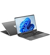
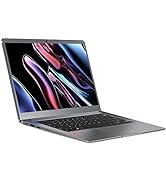
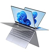
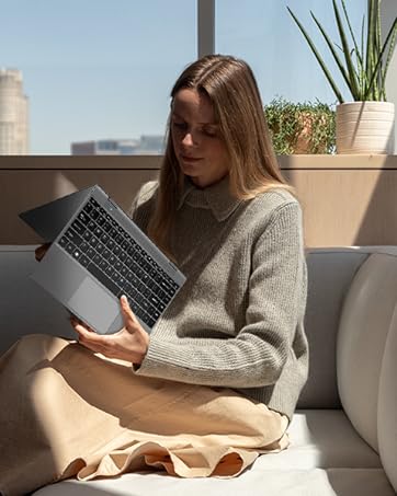
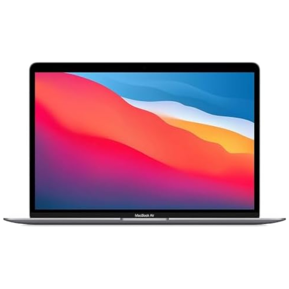
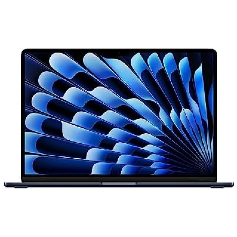
¡Bienvenido a Bitech, tu tienda de tecnología favorita! Te presentamos el BMAX MaxBook Y13 Plus, un portátil ligero y potente que te sorprenderá.
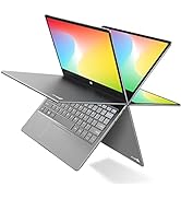
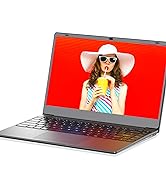
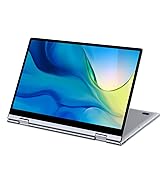
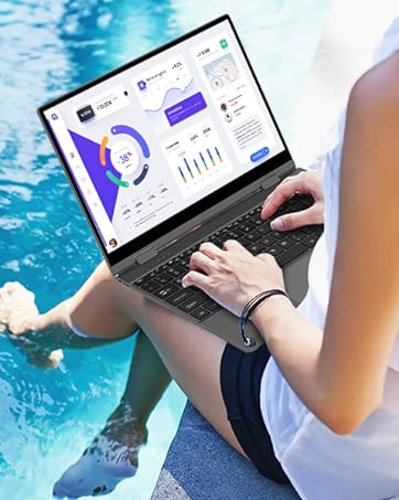
Con una pantalla táctil de alta resolución de 10 puntos y una calidad de imagen excepcional, podrás sumergirte en el mundo creado por cineastas, diseñadores de juegos y creativos. Además, su bisagra flexible te permite utilizarlo como una tableta o como un portátil, adaptándose a tus necesidades y facilitando tu creatividad.
Este portátil cuenta con un puerto de transmisión multifunción que integra funciones de transmisión de datos, transmisión de video y carga. Además, su batería de larga duración te permitirá trabajar durante todo el día sin preocuparte por quedarte sin energía.
El BMAX MaxBook Y13 Plus está equipado con una memoria de gran capacidad de 12 GB de RAM LPDDR4 y un SSD de alta velocidad de 512 GB, lo que te garantiza un rendimiento fluido y un amplio espacio de almacenamiento para tus archivos de video y álbumes de fotos.
En Bitech, nos preocupamos por tu satisfacción. Por eso, ofrecemos un servicio de garantía de 365 días y soporte técnico de por vida. Además, nuestra computadora viene con la función de "sistema de recuperación inteligente", que te permite restaurar el sistema con una tecla y resolver la mayoría de los problemas informáticos.
No pierdas la oportunidad de adquirir el BMAX MaxBook Y13 Plus en nuestra tienda en línea bitech.es. ¡Te esperamos con los mejores productos y el mejor servicio!


En BiTech, ofrecemos , 30 días de Devolución GRATUITA, para que puedas comprar con total tranquilidad. Si no estás satisfecho te devolvemos el dinero. A parte, tienes 3 años de garantía.
Más información
Descripción del producto:
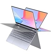
¡Bienvenido a Bitech, tu tienda de tecnología favorita! Te presentamos el BMAX MaxBook Y13 Plus, un portátil ligero y potente que te sorprenderá.
Con una pantalla táctil de alta resolución de 10 puntos y una calidad de imagen excepcional, podrás sumergirte en el mundo creado por cineastas, diseñadores de juegos y creativos. Además, su bisagra flexible te permite utilizarlo como una tableta o como un portátil, adaptándose a tus necesidades y facilitando tu creatividad.
Este portátil cuenta con un puerto de transmisión multifunción que integra funciones de transmisión de datos, transmisión de video y carga. Además, su batería de larga duración te permitirá trabajar durante todo el día sin preocuparte por quedarte sin energía.
El BMAX MaxBook Y13 Plus está equipado con una memoria de gran capacidad de 12 GB de RAM LPDDR4 y un SSD de alta velocidad de 512 GB, lo que te garantiza un rendimiento fluido y un amplio espacio de almacenamiento para tus archivos de video y álbumes de fotos.
En Bitech, nos preocupamos por tu satisfacción. Por eso, ofrecemos un servicio de garantía de 365 días y soporte técnico de por vida. Además, nuestra computadora viene con la función de "sistema de recuperación inteligente", que te permite restaurar el sistema con una tecla y resolver la mayoría de los problemas informáticos.
No pierdas la oportunidad de adquirir el BMAX MaxBook Y13 Plus en nuestra tienda en línea bitech.es. ¡Te esperamos con los mejores productos y el mejor servicio!