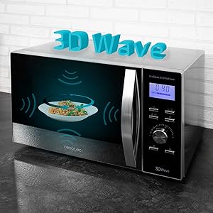
¿Buscas un microondas fácil de limpiar y con tecnología avanzada? Este modelo de Cecotec es perfecto para ti. Con su interior y exterior de acero inoxidable, la limpieza será rápida y sencilla. Además, su tecnología 3DWave garantiza resultados perfectos en poco tiempo.
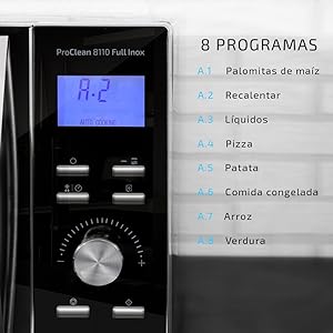
Con 8 programas predeterminados, este microondas se adapta a diferentes tipos de alimentos para obtener resultados óptimos. Su modo de descongelación asegura que los alimentos se descongelen uniformemente sin perder su sabor. ¡Y todo esto con un diseño elegante y moderno!
No pierdas la oportunidad de hacerte con este microondas de alta calidad en Bitech. ¡Haz tu vida más fácil en la cocina!

Tecnología para todos
Cecotec es el líder español de electrodomésticos, presente en más de 50 países.
Fabricante y distribuidor de más de 1800 productos, muchos de ellos top ventas en Amazon España, cuya misión es facilitar tecnología a un coste honesto a millones de hogares de todo el mundo.
CONGA es un referente mundial en aspiración con tecnologías únicas.
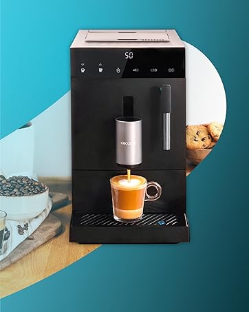
Cafeteras de todo tipo y para todos. Una democratización del placer.
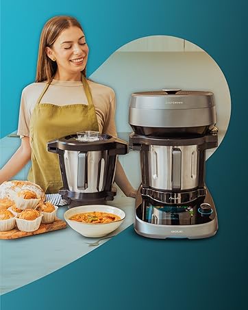
Comer bien es cada día más fácil con las innovaciones en cocina.
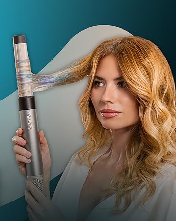
Belleza al alcance de todos con secadores iónicos y moldeadores premium.

Gracias por confiar en nosotros. El equipo de CecoCare le ayudará en lo que necesite.


En BiTech, ofrecemos , 30 días de Devolución GRATUITA, para que puedas comprar con total tranquilidad. Si no estás satisfecho te devolvemos el dinero. A parte, tienes 3 años de garantía.
Más información
¿Buscas un microondas fácil de limpiar y con tecnología avanzada? Este modelo de Cecotec es perfecto para ti. Con su interior y exterior de acero inoxidable, la limpieza será rápida y sencilla. Además, su tecnología 3DWave garantiza resultados perfectos en poco tiempo.
Con 8 programas predeterminados, este microondas se adapta a diferentes tipos de alimentos para obtener resultados óptimos. Su modo de descongelación asegura que los alimentos se descongelen uniformemente sin perder su sabor. ¡Y todo esto con un diseño elegante y moderno!
No pierdas la oportunidad de hacerte con este microondas de alta calidad en Bitech. ¡Haz tu vida más fácil en la cocina!
Tecnología para todos
Cecotec es el líder español de electrodomésticos, presente en más de 50 países.
Fabricante y distribuidor de más de 1800 productos, muchos de ellos top ventas en Amazon España, cuya misión es facilitar tecnología a un coste honesto a millones de hogares de todo el mundo.
CONGA es un referente mundial en aspiración con tecnologías únicas.
Cafeteras de todo tipo y para todos. Una democratización del placer.
Comer bien es cada día más fácil con las innovaciones en cocina.
Belleza al alcance de todos con secadores iónicos y moldeadores premium.
Gracias por confiar en nosotros. El equipo de CecoCare le ayudará en lo que necesite.