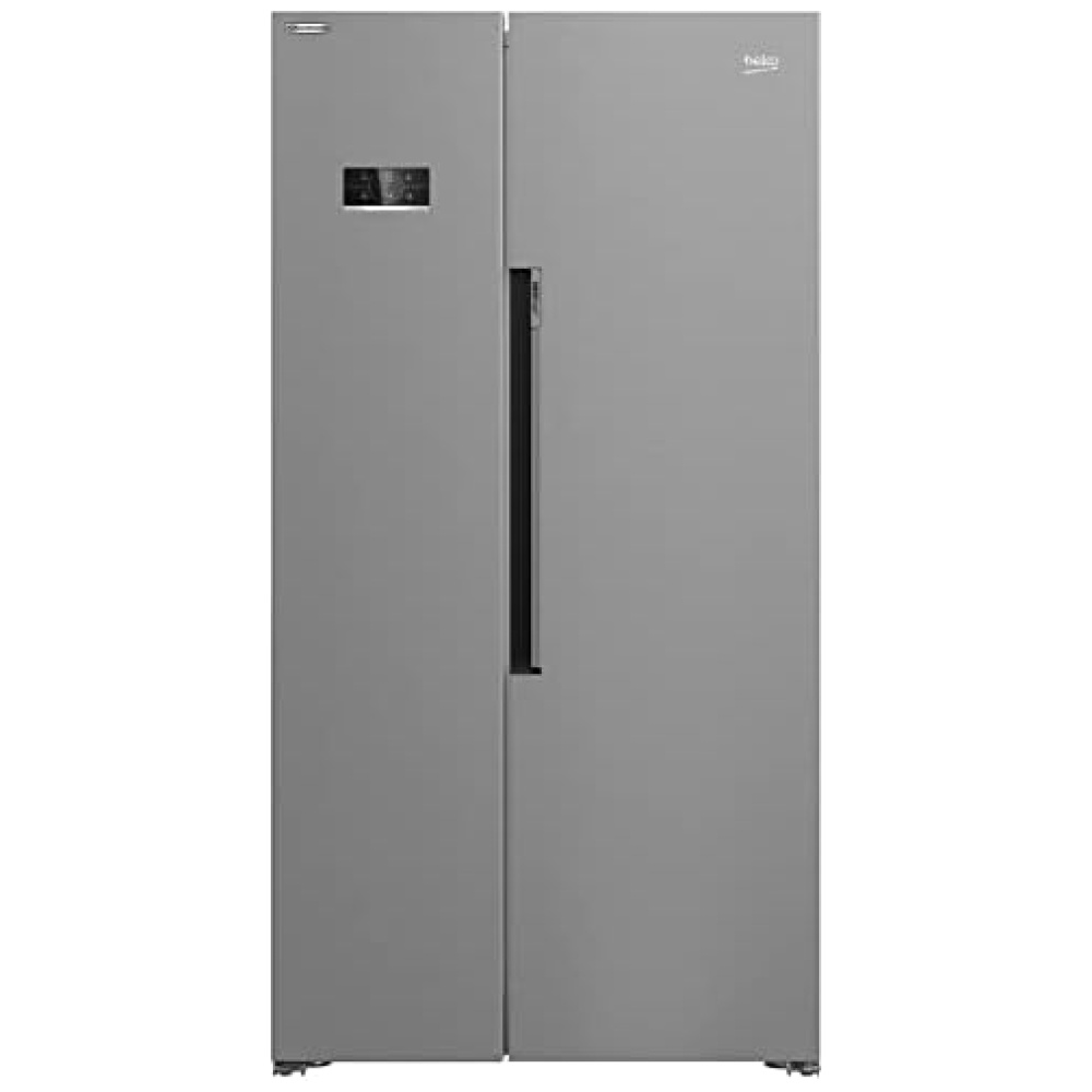
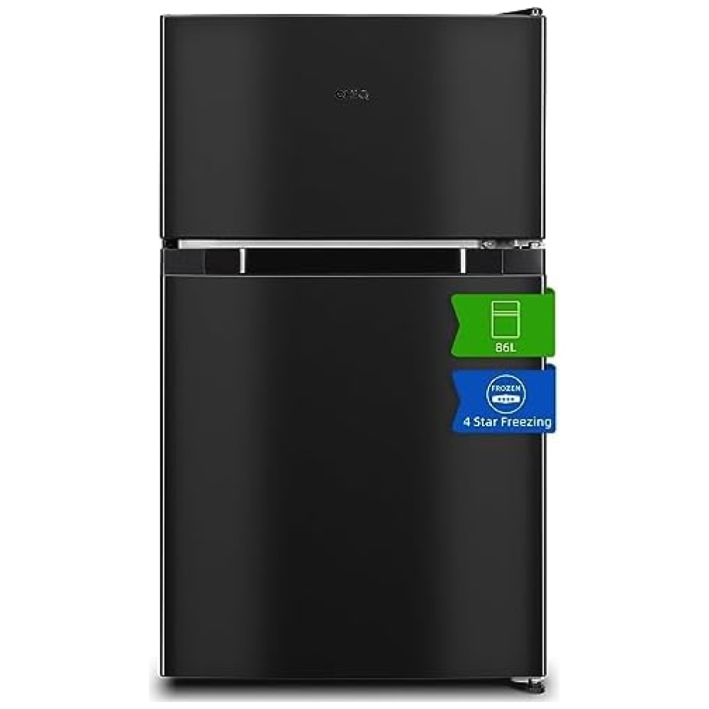
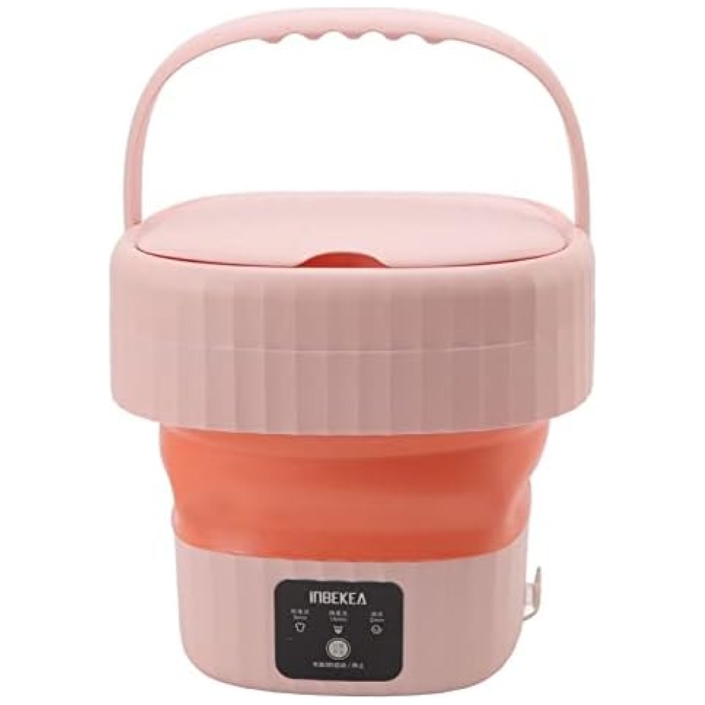
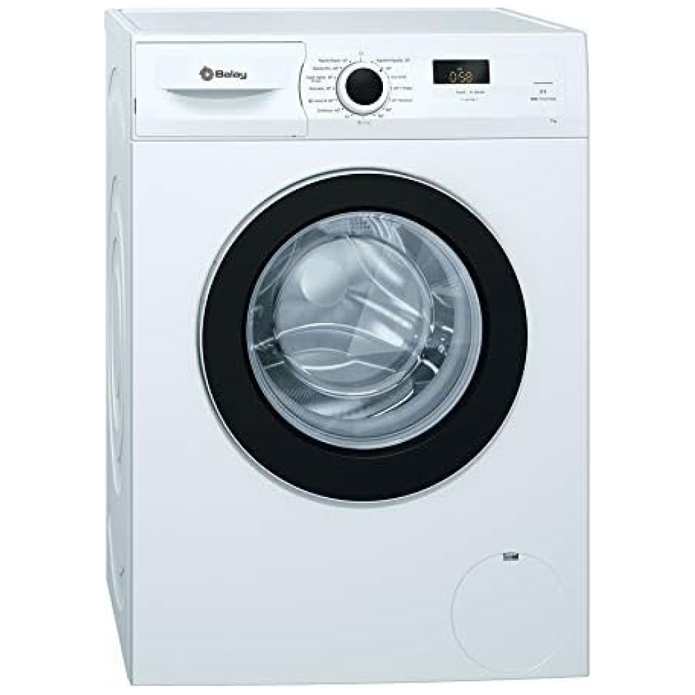
Descubre la innovación para tu hogar con Cecotec, una marca especializada en pequeños electrodomésticos y otros artículos para el hogar. En Bitech, te ofrecemos una amplia gama de productos Cecotec, como robot aspirador, robots de cocina, freidoras, menaje de cocina, descanso, fitness y ollas programables. Sus diseños inteligentes facilitan las tareas del hogar para que puedas disfrutar de tu tiempo al máximo. ¡Encuentra todo lo que necesitas en nuestra tienda online!
Desde 1995, Cecotec se ha dedicado a ofrecer productos de calidad y fiabilidad adaptados a las necesidades cambiantes. Con una amplia cartera de clientes satisfechos, Cecotec apuesta por la innovación y la tecnología de última generación en todos sus productos. En Bitech, te ofrecemos una selección de los mejores productos Cecotec para que puedas disfrutar de la comodidad y la eficiencia en tu hogar.
Descubre la tecnología pensada para ti con Cecotec. Con un diseño compacto y elegante, los productos Cecotec ofrecen la mejor calidad y seguridad en su manejo. En Bitech, encontrarás una amplia variedad de productos Cecotec para que puedas disfrutar de la última tecnología en tu hogar.
Microondas de 20 l con diseño compacto que se adapta a cualquier cocina y 700 W de potencia para calentar y cocinar cualquier alimento. Diseño negro elegante con frontal MirrorDoor efecto espejo y detalles metalizados. Interior con revestimiento Anti-Dirt iTech que repele la suciedad y facilita la limpieza. Tecnología 3DWave con un sistema de ondas más eficiente que envuelve al 100 % los alimentos. Temporizador hasta 35 minutos para programar el tiempo necesario de cada comida. Modo de descongelación que se adapta a todos los alimentos.
Tecnología para todos
Cecotec es el líder español de electrodomésticos, presente en más de 50 países.
Fabricante y distribuidor de más de 1800 productos, muchos de ellos top ventas en Amazon España, cuya misión es facilitar tecnología a un coste honesto a millones de hogares de todo el mundo.
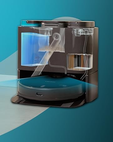
CONGA es un referente mundial en aspiración con tecnologías únicas.
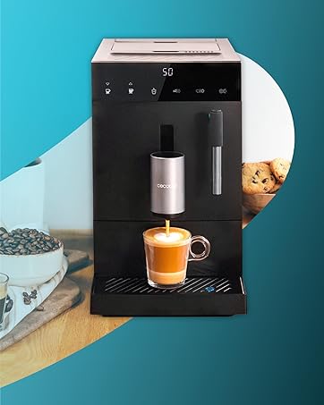
Cafeteras de todo tipo y para todos. Una democratización del placer.
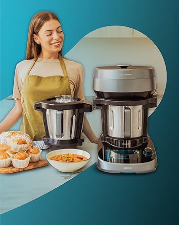
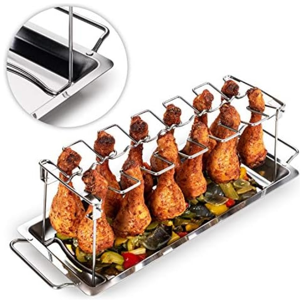
Comer bien es cada día más fácil con las innovaciones en cocina.
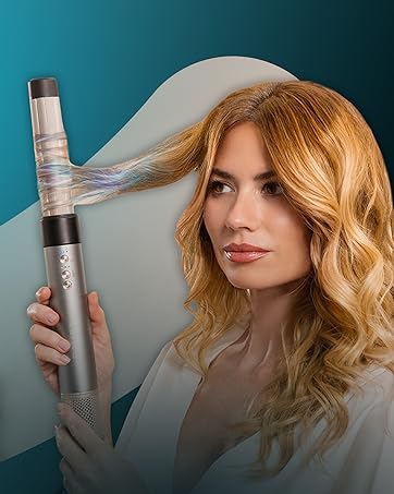
Belleza al alcance de todos con secadores iónicos y moldeadores premium.
Gracias por confiar en nosotros. El equipo de CecoCare le ayudará en lo que necesite.


En BiTech, ofrecemos , 30 días de Devolución GRATUITA, para que puedas comprar con total tranquilidad. Si no estás satisfecho te devolvemos el dinero. A parte, tienes 3 años de garantía.
Más información
Descubre la innovación para tu hogar con Cecotec, una marca especializada en pequeños electrodomésticos y otros artículos para el hogar. En Bitech, te ofrecemos una amplia gama de productos Cecotec, como robot aspirador, robots de cocina, freidoras, menaje de cocina, descanso, fitness y ollas programables. Sus diseños inteligentes facilitan las tareas del hogar para que puedas disfrutar de tu tiempo al máximo. ¡Encuentra todo lo que necesitas en nuestra tienda online!
Desde 1995, Cecotec se ha dedicado a ofrecer productos de calidad y fiabilidad adaptados a las necesidades cambiantes. Con una amplia cartera de clientes satisfechos, Cecotec apuesta por la innovación y la tecnología de última generación en todos sus productos. En Bitech, te ofrecemos una selección de los mejores productos Cecotec para que puedas disfrutar de la comodidad y la eficiencia en tu hogar.
Descubre la tecnología pensada para ti con Cecotec. Con un diseño compacto y elegante, los productos Cecotec ofrecen la mejor calidad y seguridad en su manejo. En Bitech, encontrarás una amplia variedad de productos Cecotec para que puedas disfrutar de la última tecnología en tu hogar.
Microondas de 20 l con diseño compacto que se adapta a cualquier cocina y 700 W de potencia para calentar y cocinar cualquier alimento. Diseño negro elegante con frontal MirrorDoor efecto espejo y detalles metalizados. Interior con revestimiento Anti-Dirt iTech que repele la suciedad y facilita la limpieza. Tecnología 3DWave con un sistema de ondas más eficiente que envuelve al 100 % los alimentos. Temporizador hasta 35 minutos para programar el tiempo necesario de cada comida. Modo de descongelación que se adapta a todos los alimentos.
Tecnología para todos
Cecotec es el líder español de electrodomésticos, presente en más de 50 países.
Fabricante y distribuidor de más de 1800 productos, muchos de ellos top ventas en Amazon España, cuya misión es facilitar tecnología a un coste honesto a millones de hogares de todo el mundo.
CONGA es un referente mundial en aspiración con tecnologías únicas.
Cafeteras de todo tipo y para todos. Una democratización del placer.
Comer bien es cada día más fácil con las innovaciones en cocina.
Belleza al alcance de todos con secadores iónicos y moldeadores premium.
Gracias por confiar en nosotros. El equipo de CecoCare le ayudará en lo que necesite.