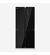
Descripción del producto
¡Bienvenido a Bitech, tu tienda de tecnología! Te presentamos nuestro increíble frigorífico combi, perfecto para mantener tus alimentos frescos y deliciosos. Con una capacidad total de 326 litros, tendrás espacio de sobra para toda la semana. Olvídate de descongelar tu frigorífico constantemente, nuestro sistema No Frost se encargará de mantenerlo libre de escarcha. Además, su sistema silencioso de 41 dB hará que ni siquiera notes que está ahí.
Nuestro frigorífico combi es totalmente versátil, gracias a su puerta reversible podrás ubicarlo en cualquier rincón de tu hogar sin complicaciones. Y no te preocupes por la temperatura, con sus 2 modos, Summer y Super Freezer, podrás controlarla fácilmente.
Organiza tus alimentos de manera eficiente con nuestras estanterías, cajoneras y cestas. Además, cuenta con una Fresh Box y una Vegan Box para mantener tus carnes, pescados, frutas y hortalizas frescos por más tiempo.
Pero no solo es práctico, también es elegante. Su diseño en color inox le dará un toque moderno a tu cocina. Y lo mejor de todo, es un producto de UniversalBlue, una marca española que diseña sus productos en Murcia.
No pierdas la oportunidad de tener un frigorífico de calidad en tu hogar. ¡Visita bitech.es y descubre todos nuestros productos!


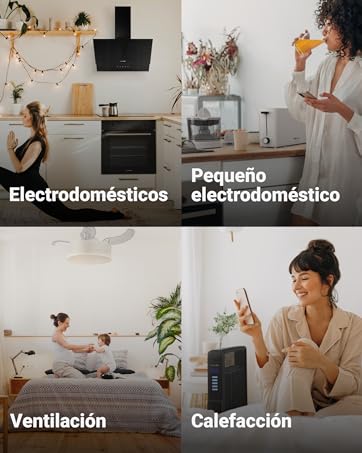
Descubre tu nueva marca de electrodomésticos.
Una marca nacida en Murcia, que diseña y fabrica sus electrodomésticos pensando en tu hogar y en sus necesidades.
Disfruta de tu tiempo, de los productos que facilitan tu día a día y del diseño de tu hogar. Nosotros nos encargamos del resto.
Bienvenidx a UniversalBlue.


En BiTech, ofrecemos , 30 días de Devolución GRATUITA, para que puedas comprar con total tranquilidad. Si no estás satisfecho te devolvemos el dinero. A parte, tienes 3 años de garantía.
Más información
Descripción del producto
¡Bienvenido a Bitech, tu tienda de tecnología! Te presentamos nuestro increíble frigorífico combi, perfecto para mantener tus alimentos frescos y deliciosos. Con una capacidad total de 326 litros, tendrás espacio de sobra para toda la semana. Olvídate de descongelar tu frigorífico constantemente, nuestro sistema No Frost se encargará de mantenerlo libre de escarcha. Además, su sistema silencioso de 41 dB hará que ni siquiera notes que está ahí.
Nuestro frigorífico combi es totalmente versátil, gracias a su puerta reversible podrás ubicarlo en cualquier rincón de tu hogar sin complicaciones. Y no te preocupes por la temperatura, con sus 2 modos, Summer y Super Freezer, podrás controlarla fácilmente.
Organiza tus alimentos de manera eficiente con nuestras estanterías, cajoneras y cestas. Además, cuenta con una Fresh Box y una Vegan Box para mantener tus carnes, pescados, frutas y hortalizas frescos por más tiempo.
Pero no solo es práctico, también es elegante. Su diseño en color inox le dará un toque moderno a tu cocina. Y lo mejor de todo, es un producto de UniversalBlue, una marca española que diseña sus productos en Murcia.
No pierdas la oportunidad de tener un frigorífico de calidad en tu hogar. ¡Visita bitech.es y descubre todos nuestros productos!
Descubre tu nueva marca de electrodomésticos.
Una marca nacida en Murcia, que diseña y fabrica sus electrodomésticos pensando en tu hogar y en sus necesidades.
Disfruta de tu tiempo, de los productos que facilitan tu día a día y del diseño de tu hogar. Nosotros nos encargamos del resto.
Bienvenidx a UniversalBlue.