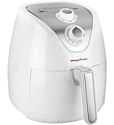
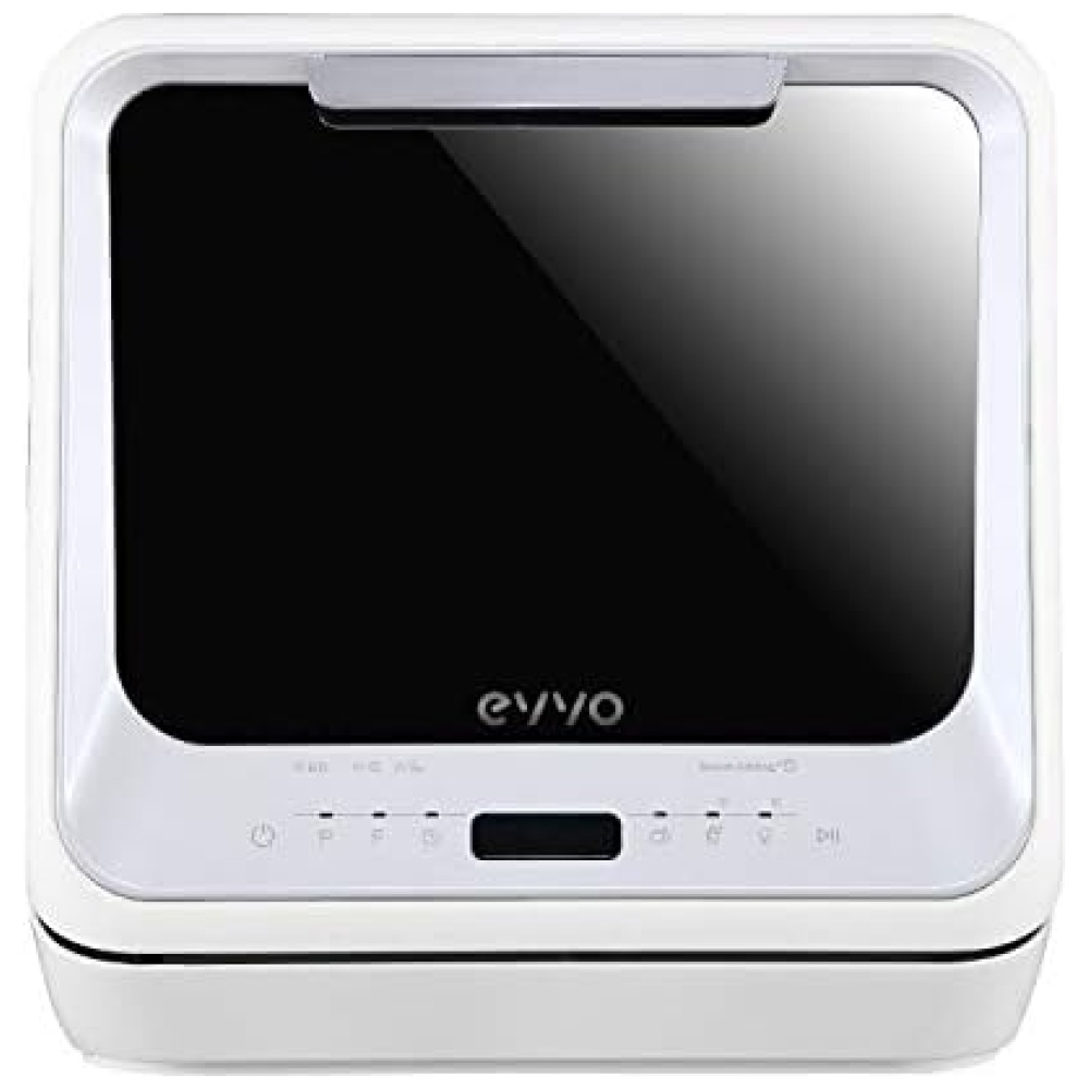
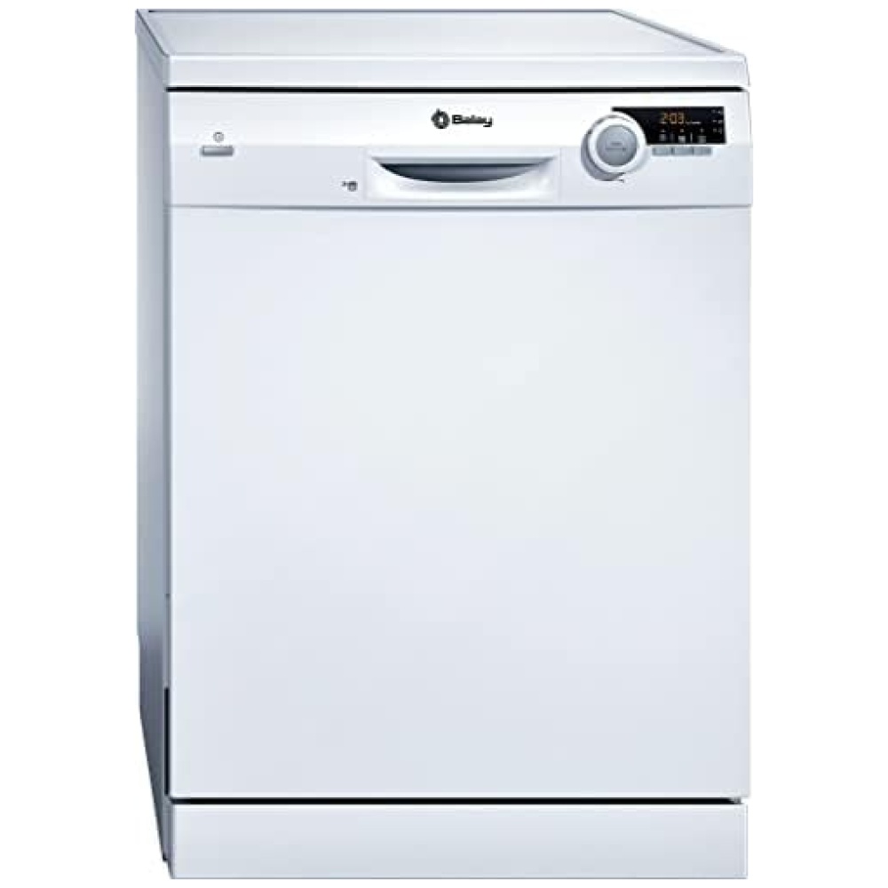
En Bitech.es, te presentamos la increíble cafetera MAGEFESA modelo JAMAICA BROWN, diseñada especialmente para aquellos amantes del café que buscan la máxima calidad. Con capacidad para 12 tazas, esta cafetera ha sido creada prestando atención a cada detalle, para que puedas disfrutar de una experiencia óptima desde el primer momento. Además, su diseño en multicolor le dará un toque de estilo a tu cocina.
En Bitech.es, te ofrecemos este producto de alta calidad, con todas las garantías de funcionamiento y durabilidad. No te preocupes por las actualizaciones de software, ya que te aseguramos que estarán disponibles hasta el último momento. Además, al ser un producto de origen nacional, contribuyes al desarrollo de nuestra economía. ¡No pierdas la oportunidad de adquirir esta cafetera en Bitech.es desde hace tiempo!
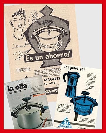
Desde 1948.
SIEMPRE CERCA DE TI
Somos la olla de tu abuela y el robot de cocina de tus hijos.
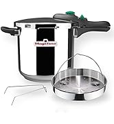
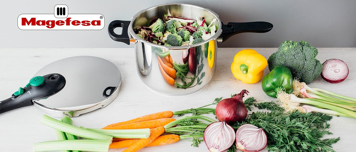
Magefesa es uno de los líderes europeos en artículos de menaje de cocina del hogar y ollas a presión, desde que iniciamos nuestra actividad en 1948. En España la marca más importante en la elaboración de ollas a presión. Priorizando la calidad, seguridad e innovación durante las últimas generaciones.
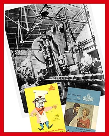
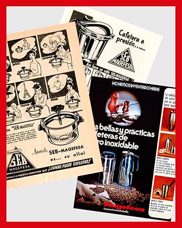
HISTORIA
Magefesa fue fundada en Getxon en 1948, y fue creciendo paulatinamente. Las ollas a presión confiables fueron los principales productos de la marca en ese siglo.
En 1976 recibió el título de "empresa ejemplar" en un acto dirigido por Juan Carlos de España. En su apogeo, contó con 4.000 empleados, ocho fábricas y un catálogo de 6.500 referencias.
En la actualidad la empresa sigue funcionando con el mismo ideal de innovación y pasión.
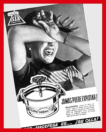
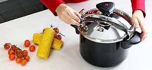
Tu seguridad en la cocina es uno de nuestros principales compromisos. Nuestras ollas a presión tienen hasta 5 sistemas de seguridad para que cocinar sea todo un placer sin preocupaciones.
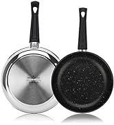
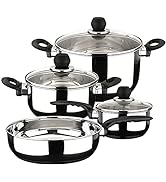
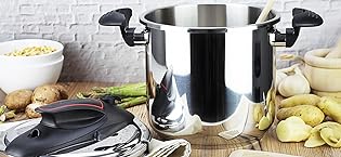
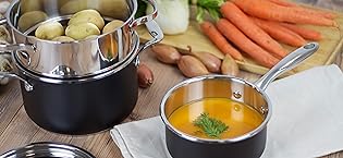
Productos programables y eficientes que trabajan por ti , materiales más sostenibles… Alta calidad, durabilidad y exigencia son nuestras máximas en el desarrollo de soluciones integrales para el hogar.
Nuestro objetivo es reducir el impacto de los productos Magefesa en el medio ambiente, tanto reduciendo los tiempos de cocción como ahorrando energía y agua con nuestras ollas a presión.


En BiTech, ofrecemos , 30 días de Devolución GRATUITA, para que puedas comprar con total tranquilidad. Si no estás satisfecho te devolvemos el dinero. A parte, tienes 3 años de garantía.
Más información
En Bitech.es, te presentamos la increíble cafetera MAGEFESA modelo JAMAICA BROWN, diseñada especialmente para aquellos amantes del café que buscan la máxima calidad. Con capacidad para 12 tazas, esta cafetera ha sido creada prestando atención a cada detalle, para que puedas disfrutar de una experiencia óptima desde el primer momento. Además, su diseño en multicolor le dará un toque de estilo a tu cocina.
En Bitech.es, te ofrecemos este producto de alta calidad, con todas las garantías de funcionamiento y durabilidad. No te preocupes por las actualizaciones de software, ya que te aseguramos que estarán disponibles hasta el último momento. Además, al ser un producto de origen nacional, contribuyes al desarrollo de nuestra economía. ¡No pierdas la oportunidad de adquirir esta cafetera en Bitech.es desde hace tiempo!
Desde 1948.
SIEMPRE CERCA DE TI
Somos la olla de tu abuela y el robot de cocina de tus hijos.
Magefesa es uno de los líderes europeos en artículos de menaje de cocina del hogar y ollas a presión, desde que iniciamos nuestra actividad en 1948. En España la marca más importante en la elaboración de ollas a presión. Priorizando la calidad, seguridad e innovación durante las últimas generaciones.
HISTORIA
Magefesa fue fundada en Getxon en 1948, y fue creciendo paulatinamente. Las ollas a presión confiables fueron los principales productos de la marca en ese siglo.
En 1976 recibió el título de "empresa ejemplar" en un acto dirigido por Juan Carlos de España. En su apogeo, contó con 4.000 empleados, ocho fábricas y un catálogo de 6.500 referencias.
En la actualidad la empresa sigue funcionando con el mismo ideal de innovación y pasión.
Tu seguridad en la cocina es uno de nuestros principales compromisos. Nuestras ollas a presión tienen hasta 5 sistemas de seguridad para que cocinar sea todo un placer sin preocupaciones.
Productos programables y eficientes que trabajan por ti , materiales más sostenibles… Alta calidad, durabilidad y exigencia son nuestras máximas en el desarrollo de soluciones integrales para el hogar.
Nuestro objetivo es reducir el impacto de los productos Magefesa en el medio ambiente, tanto reduciendo los tiempos de cocción como ahorrando energía y agua con nuestras ollas a presión.