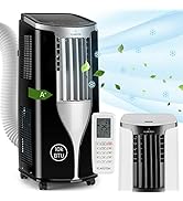
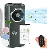
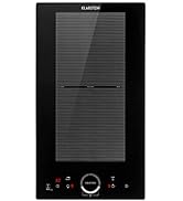
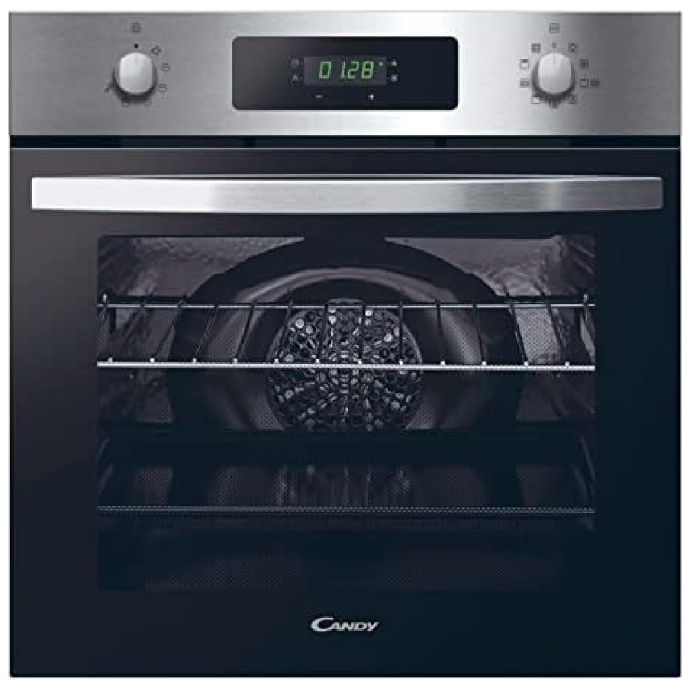
Descripción del producto:
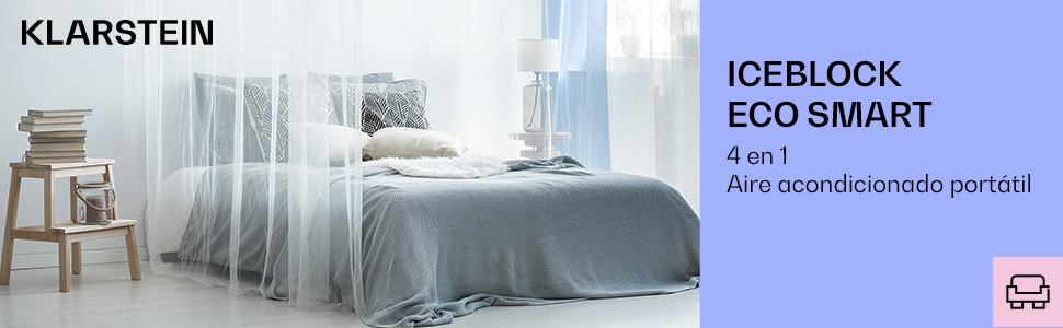


Aplicable de forma flexible: A diferencia de las unidades de aire acondicionado instaladas de forma permanente, una unidad móvil solo necesita una ventana para transportar el aire caliente de salida al exterior. Para una conexión sin complicaciones
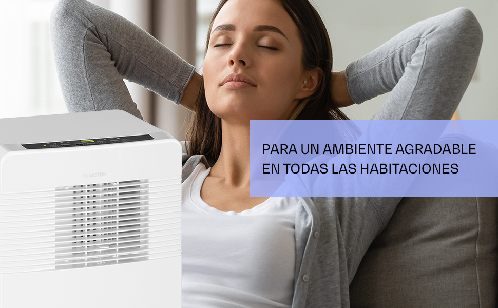
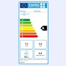
El clima en el hogar es crucial para tu salud. Puedes controlarlo con nuestros aires acondicionados y humidificadores inteligentes.

Nuestros productos para la cocina y el hogar te acompañan desde la mañana hasta la noche y te garantizan un mayor confort diario en el hogar. Aquí confluye lo que Klarstein ha sido desde el principio: la combinación de tecnología innovadora, diseño de alta calidad y excelente relación calidad-valor, con nuestros clientes siempre en el centro de todo lo que hacemos.


En BiTech, ofrecemos , 30 días de Devolución GRATUITA, para que puedas comprar con total tranquilidad. Si no estás satisfecho te devolvemos el dinero. A parte, tienes 3 años de garantía.
Más información
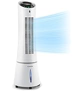
Descripción del producto:
Aplicable de forma flexible: A diferencia de las unidades de aire acondicionado instaladas de forma permanente, una unidad móvil solo necesita una ventana para transportar el aire caliente de salida al exterior. Para una conexión sin complicaciones El clima en el hogar es crucial para tu salud. Puedes controlarlo con nuestros aires acondicionados y humidificadores inteligentes.
Nuestros productos para la cocina y el hogar te acompañan desde la mañana hasta la noche y te garantizan un mayor confort diario en el hogar. Aquí confluye lo que Klarstein ha sido desde el principio: la combinación de tecnología innovadora, diseño de alta calidad y excelente relación calidad-valor, con nuestros clientes siempre en el centro de todo lo que hacemos.