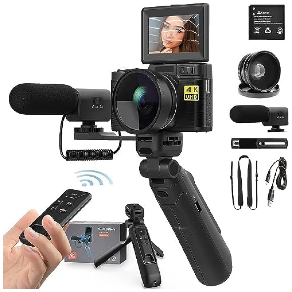
¡Descubre nuestra cámara digital en Bitech.es! Con una pantalla LCD HD de 3 pulgadas, podrás capturar imágenes nítidas y ajustar fácilmente la composición y los parámetros para obtener la imagen perfecta. Además, su luz de flash incorporada te permitirá tomar fotos incluso en entornos oscuros. Y no te preocupes por la batería, ¡tiene una capacidad de 1500 mAh que dura mucho tiempo!
Nuestra cámara es perfecta para reuniones familiares y aventuras al aire libre. Es fácil de usar, cómoda de sostener y muy ligera. ¡Incluso puede ser un regalo ideal para los más pequeños!
No esperes más, visita Bitech.es y descubre todas las características de nuestra cámara digital. ¡Te encantará!


En BiTech, ofrecemos , 30 días de Devolución GRATUITA, para que puedas comprar con total tranquilidad. Si no estás satisfecho te devolvemos el dinero. A parte, tienes 3 años de garantía.
Más información
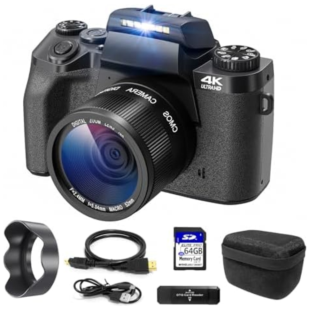
¡Descubre nuestra cámara digital en Bitech.es! Con una pantalla LCD HD de 3 pulgadas, podrás capturar imágenes nítidas y ajustar fácilmente la composición y los parámetros para obtener la imagen perfecta. Además, su luz de flash incorporada te permitirá tomar fotos incluso en entornos oscuros. Y no te preocupes por la batería, ¡tiene una capacidad de 1500 mAh que dura mucho tiempo!
Nuestra cámara es perfecta para reuniones familiares y aventuras al aire libre. Es fácil de usar, cómoda de sostener y muy ligera. ¡Incluso puede ser un regalo ideal para los más pequeños!
No esperes más, visita Bitech.es y descubre todas las características de nuestra cámara digital. ¡Te encantará!