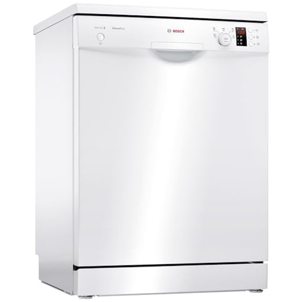
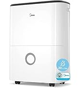
Descripción del producto:

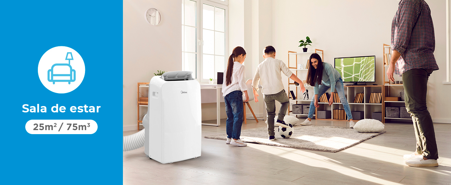
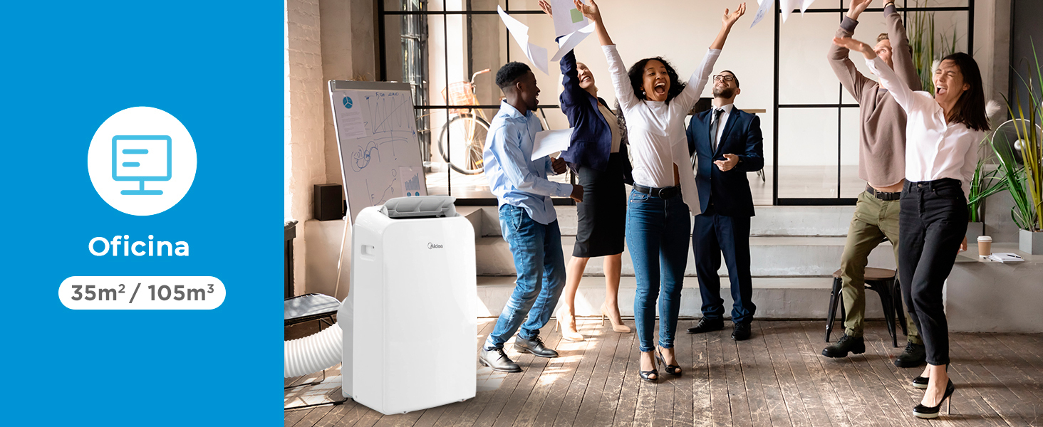
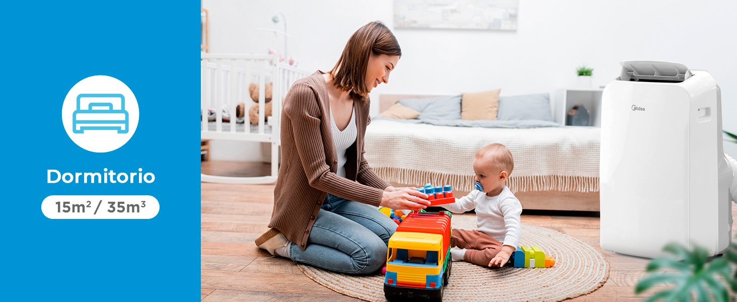
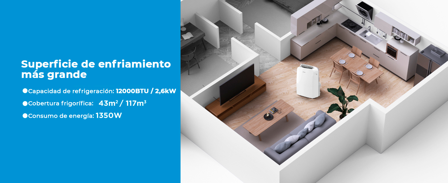
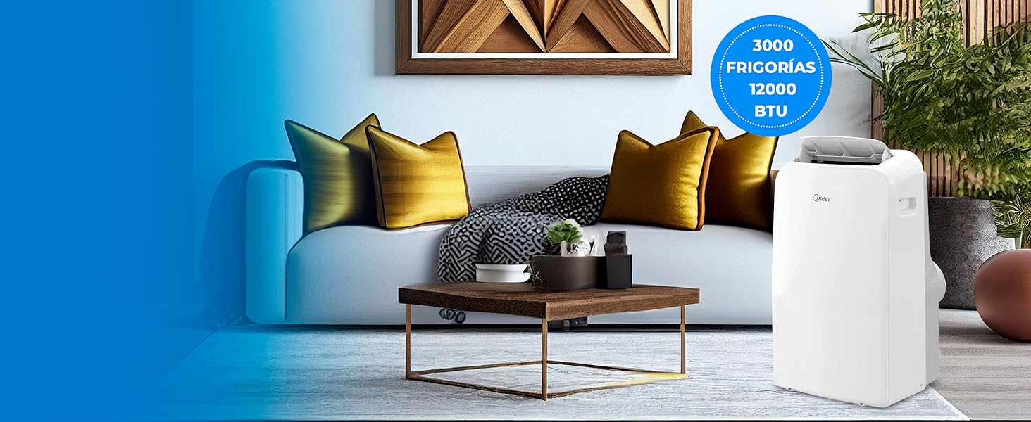 Ideal para enfriar grandes espacios. Potencia máxima en tus manos, su capacidad de 12000 BTU garantiza un ambiente fresco y confortable en segundos. Disfruta de un enfriamiento eficiente y rápido en cualquier lugar. No permitas que el calor te agobie, experimenta el poder de Midea en cada rincón de tu vida.

 <img alt="a" src="https://m.media-amazon.com/images/S/aplus-media-library-service-media/da7dc39c-fbb6-49d1-b4cc-27f542afda8f.__CR0,0,1464,600_PT0_SX1464_V1
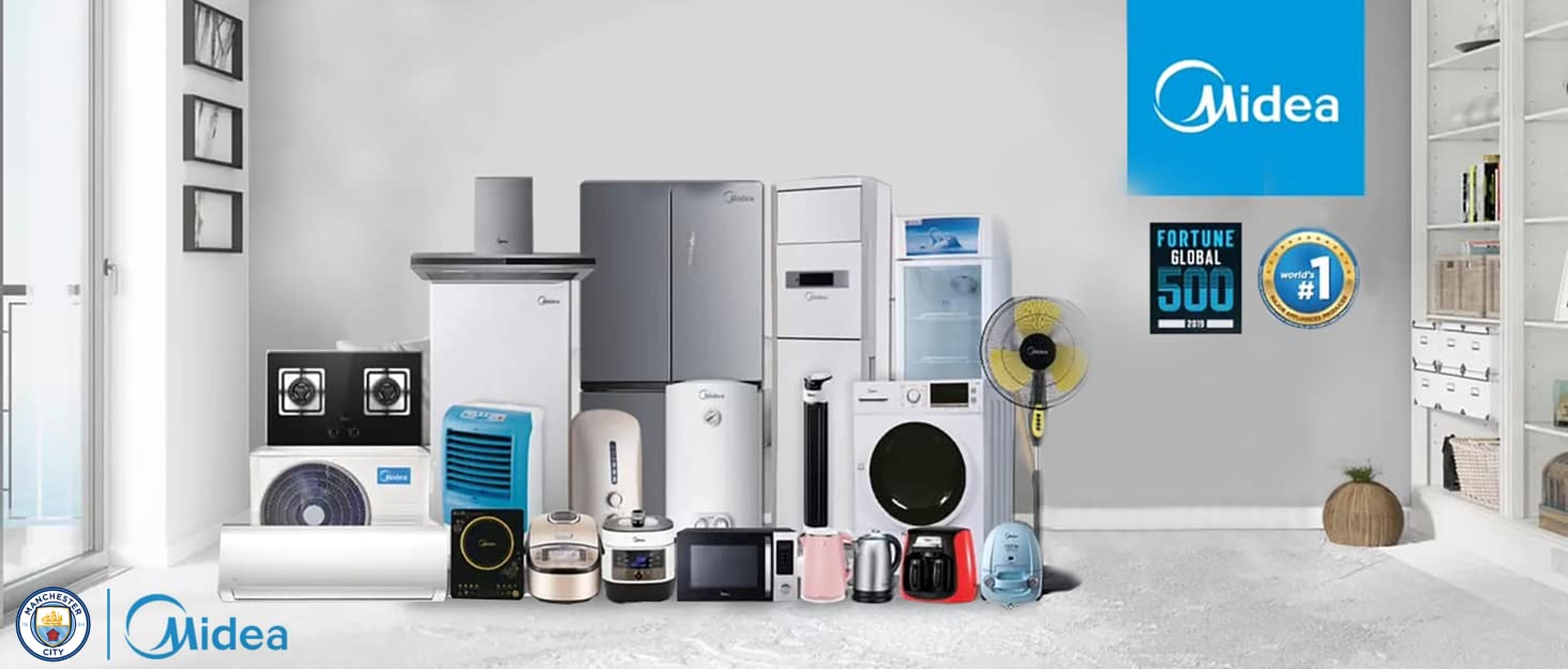

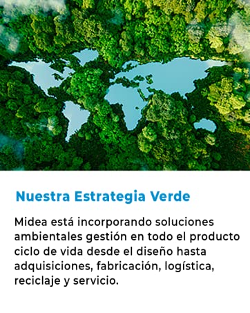
Fundada en 1968, Midea es la marca de electrodomésticos del Grupo Midea, una de las principales empresas de la lista Global Fortune 500 con presencia en 195 países y 21 plantas de producción en todo el mundo.
Nos comprometemos a ofrecer soluciones sorprendentes para que nuestros clientes puedan disfrutar de esos pequeños momentos en casa.


En BiTech, ofrecemos , 30 días de Devolución GRATUITA, para que puedas comprar con total tranquilidad. Si no estás satisfecho te devolvemos el dinero. A parte, tienes 3 años de garantía.
Más información
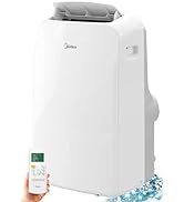
Descripción del producto:
Ideal para enfriar grandes espacios. Potencia máxima en tus manos, su capacidad de 12000 BTU garantiza un ambiente fresco y confortable en segundos. Disfruta de un enfriamiento eficiente y rápido en cualquier lugar. No permitas que el calor te agobie, experimenta el poder de Midea en cada rincón de tu vida.
<img alt="a" src="https://m.media-amazon.com/images/S/aplus-media-library-service-media/da7dc39c-fbb6-49d1-b4cc-27f542afda8f.__CR0,0,1464,600_PT0_SX1464_V1
Fundada en 1968, Midea es la marca de electrodomésticos del Grupo Midea, una de las principales empresas de la lista Global Fortune 500 con presencia en 195 países y 21 plantas de producción en todo el mundo.
Nos comprometemos a ofrecer soluciones sorprendentes para que nuestros clientes puedan disfrutar de esos pequeños momentos en casa.