¡Descubre más sobre este increíble producto en Bitech.es!
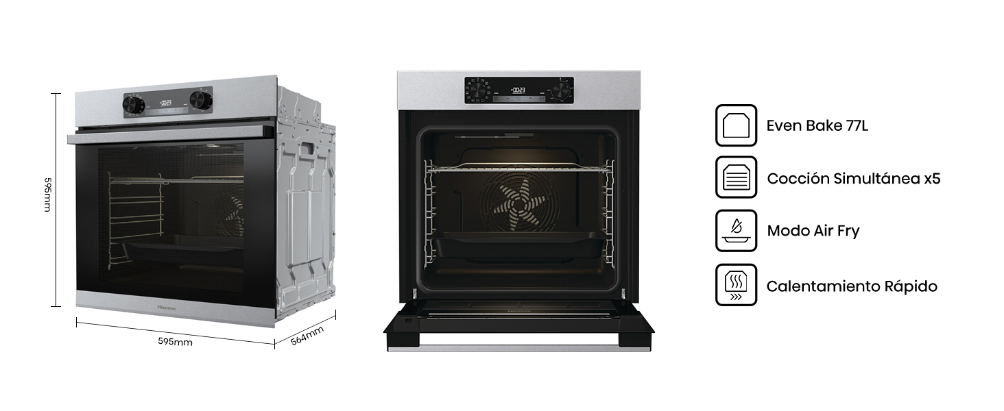
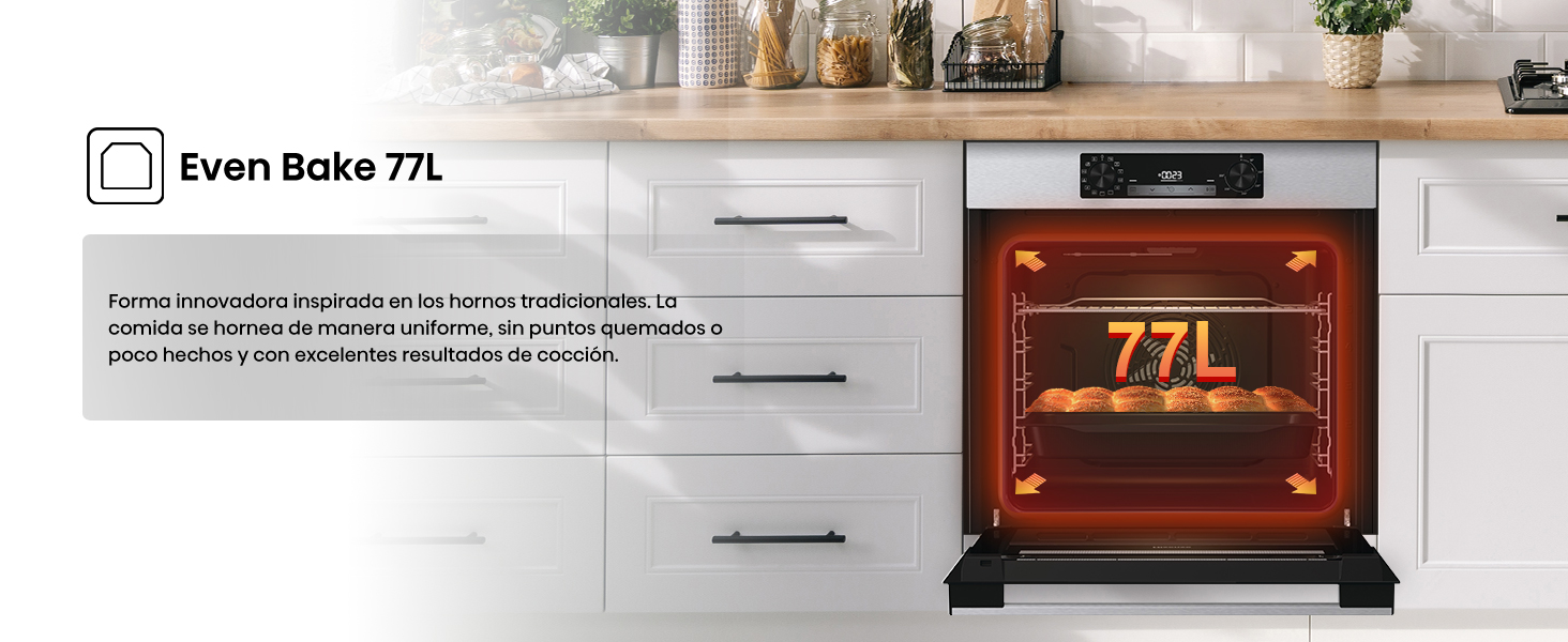
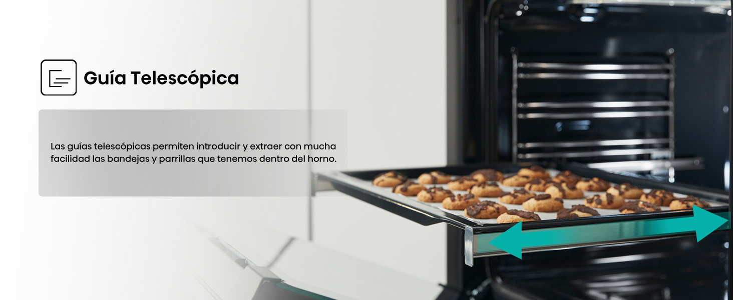
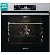
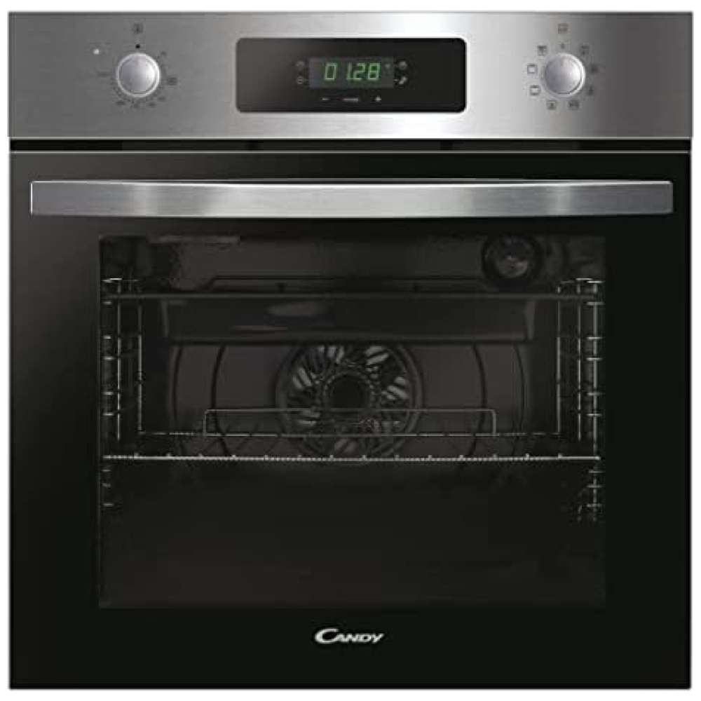
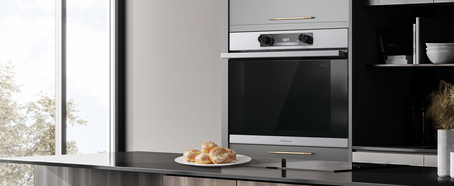
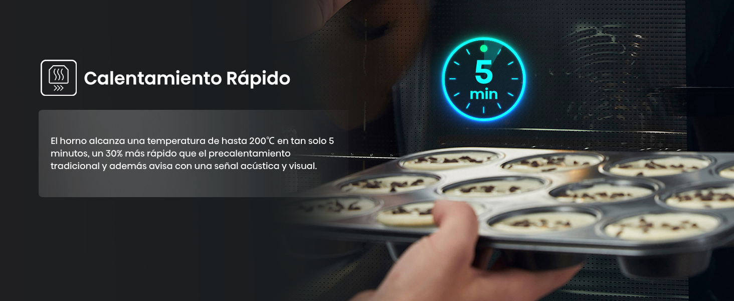 1 Even Bake 77L 2 Puerta Extraíble 3 Guía Telescópica 4 Calentamiento Rápido
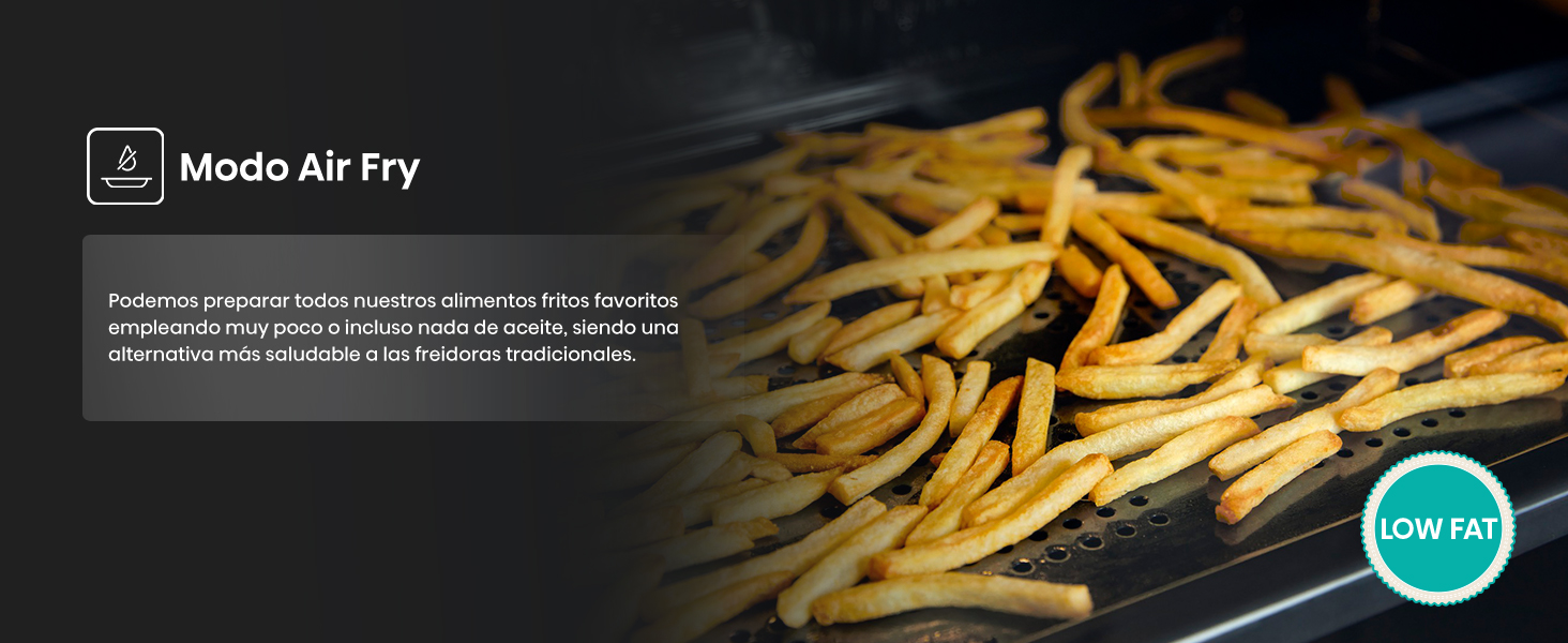
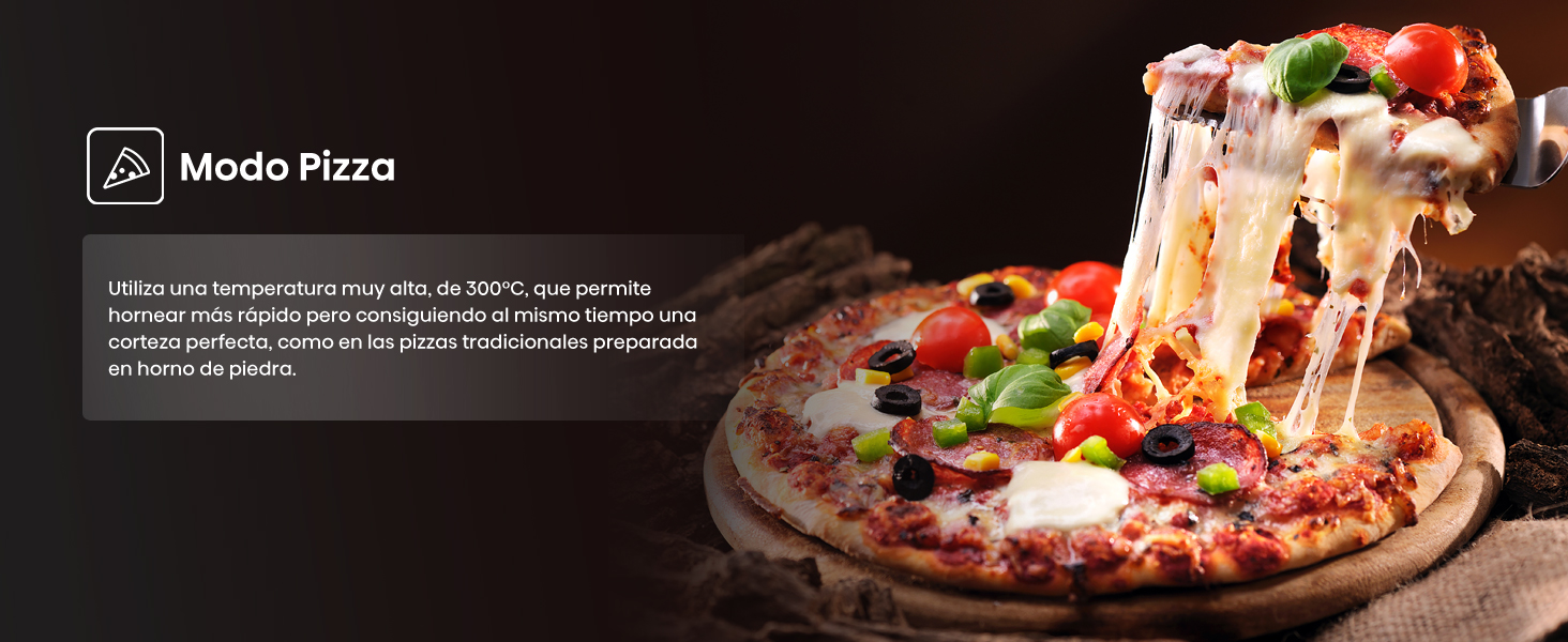
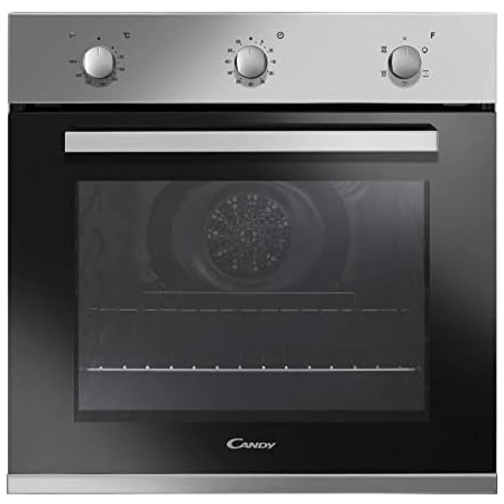
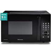
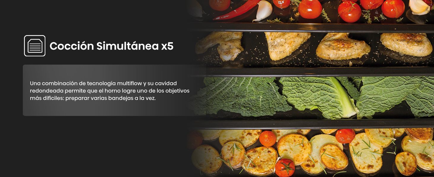 1 Modo Air Fry 2 Cocción Congelados 3 Modo Grill 4 Modo Pizza 5 Cocción Simultánea X5
¡Descubre las características de este producto en Bitech.es!
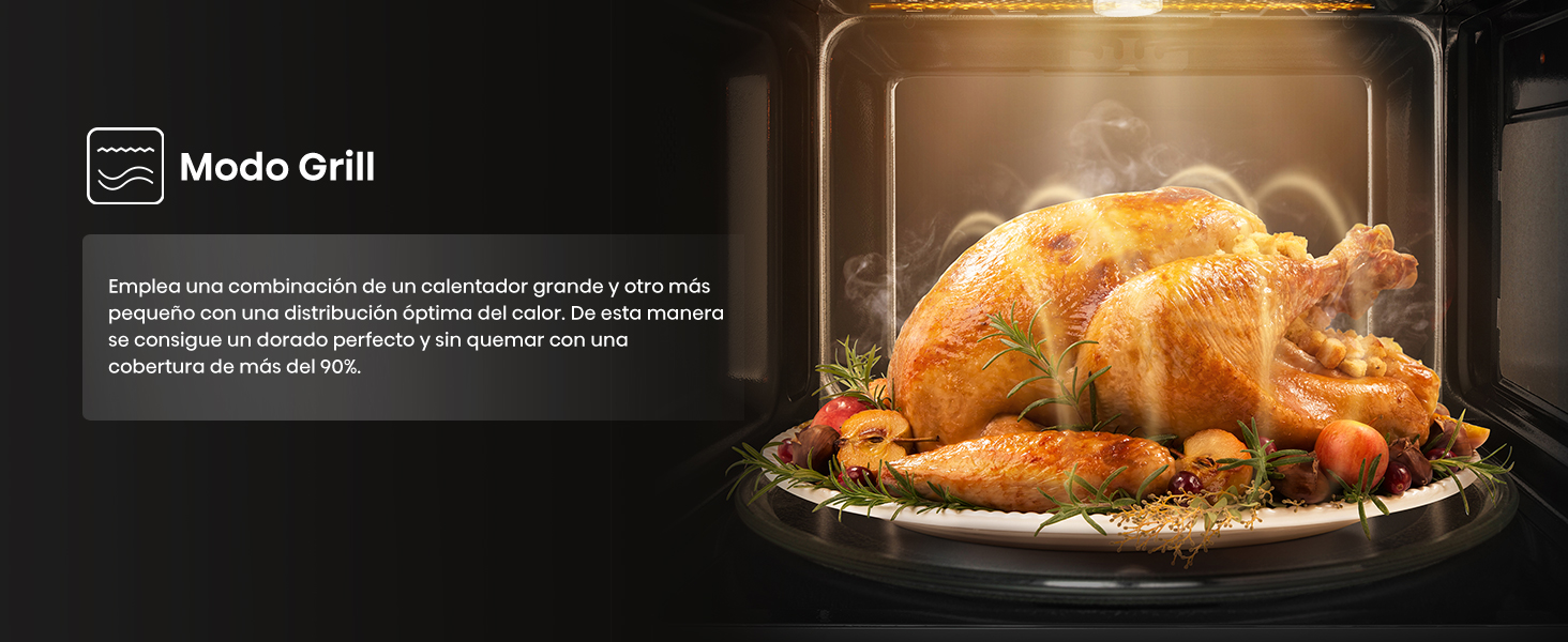
- [Modo Grill] Emplea una combinación de un calentador grande y otro más pequeño con una distribución óptima del calor. De esta manera se consigue un dorado perfecto y sin quemar con una cobertura de más del 90%.
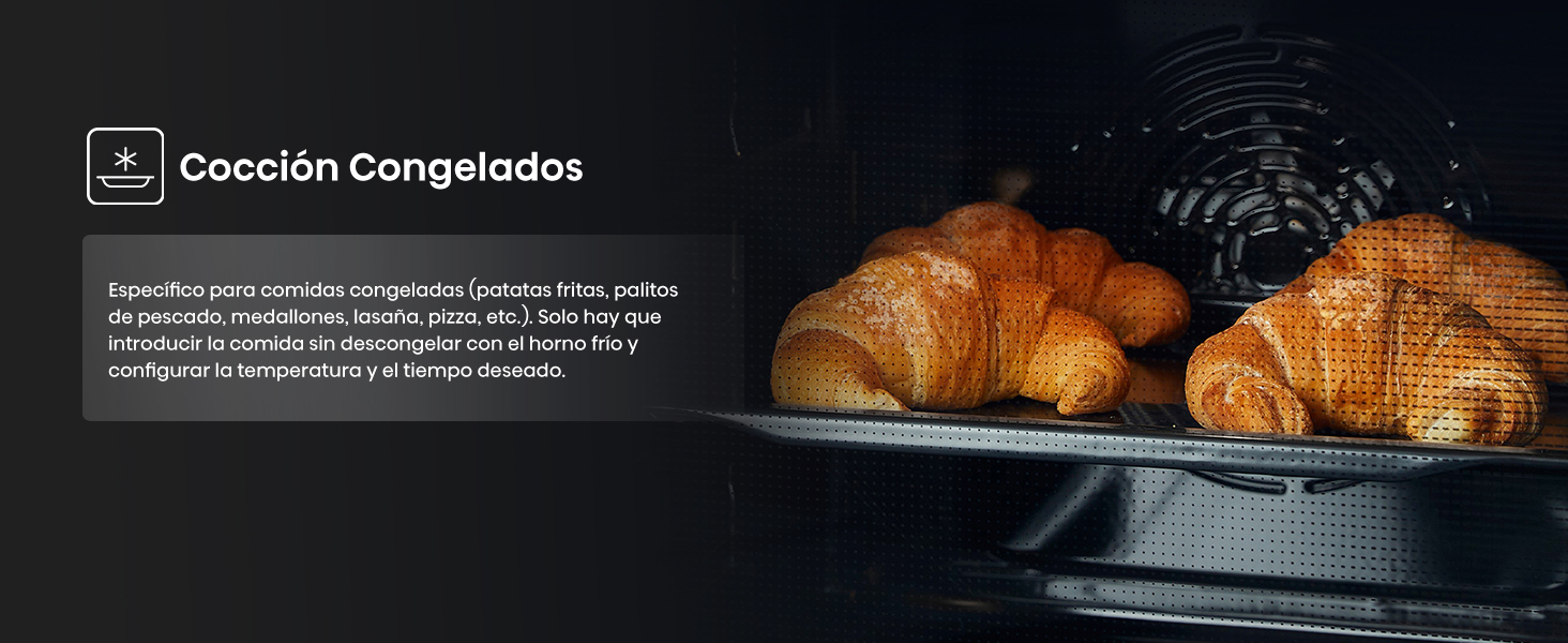
- [Cocción Congelados] Específico para comidas congeladas (patatas fritas, palitos de pescado, medallones, lasaña, pizza, etc.). Solo hay que introducir la comida sin descongelar con el horno frío y configurar la temperatura y el tiempo deseado.
- [Eficiencia Energética] En Hisense constantemente estamos desarrollando productos más respetuosos con el medio ambiente, más eficientes y que reducen el consumo energético y ahorran dinero.
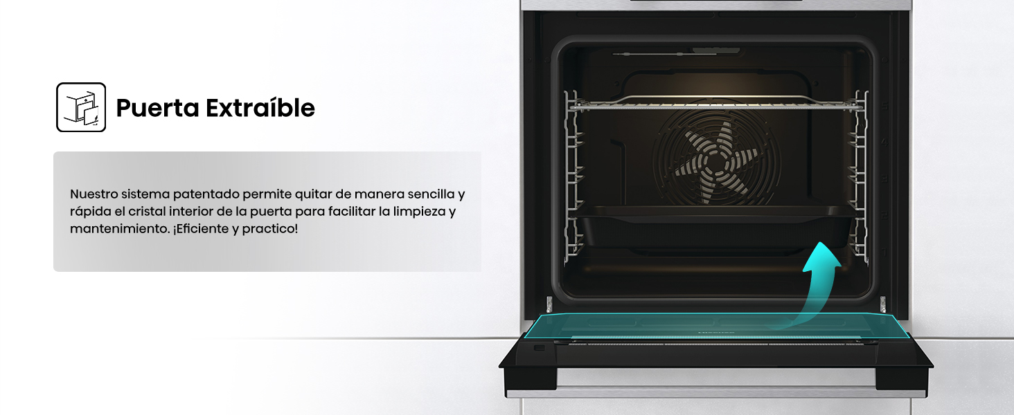
- [Puerta Extraíble] Nuestro sistema patentado permite quitar de manera sencilla y rápida el cristal interior de la puerta para facilitar la limpieza y mantenimiento. ¡Eficiente y práctico!

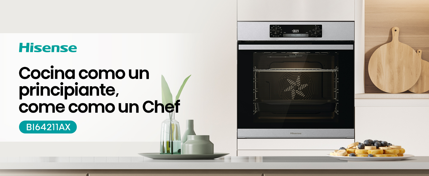
Calidad e Innovación para tu Hogar


En BiTech, ofrecemos , 30 días de Devolución GRATUITA, para que puedas comprar con total tranquilidad. Si no estás satisfecho te devolvemos el dinero. A parte, tienes 3 años de garantía.
Más información
¡Descubre más sobre este increíble producto en Bitech.es!
1 Even Bake 77L 2 Puerta Extraíble 3 Guía Telescópica 4 Calentamiento Rápido
1 Modo Air Fry 2 Cocción Congelados 3 Modo Grill 4 Modo Pizza 5 Cocción Simultánea X5
¡Descubre las características de este producto en Bitech.es!
- [Modo Grill] Emplea una combinación de un calentador grande y otro más pequeño con una distribución óptima del calor. De esta manera se consigue un dorado perfecto y sin quemar con una cobertura de más del 90%.
- [Cocción Congelados] Específico para comidas congeladas (patatas fritas, palitos de pescado, medallones, lasaña, pizza, etc.). Solo hay que introducir la comida sin descongelar con el horno frío y configurar la temperatura y el tiempo deseado.
- [Eficiencia Energética] En Hisense constantemente estamos desarrollando productos más respetuosos con el medio ambiente, más eficientes y que reducen el consumo energético y ahorran dinero.
- [Puerta Extraíble] Nuestro sistema patentado permite quitar de manera sencilla y rápida el cristal interior de la puerta para facilitar la limpieza y mantenimiento. ¡Eficiente y práctico!
Calidad e Innovación para tu Hogar