1
¡Operación rápida garantizada! La computadora portátil BMAX Y13 de Bitech es perfecta para manejar múltiples tareas gracias a sus 8 GB de RAM y 256 GB de SSD. Con esta potencia, podrás ejecutar aplicaciones y transferir archivos de manera más rápida que nunca. Además, su inicio es tan rápido que solo tomará unos segundos.
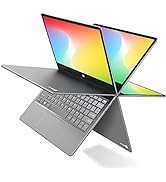
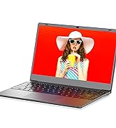
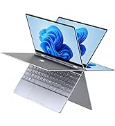
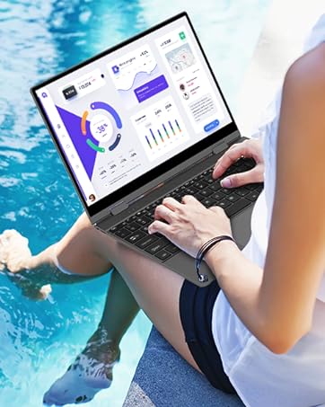
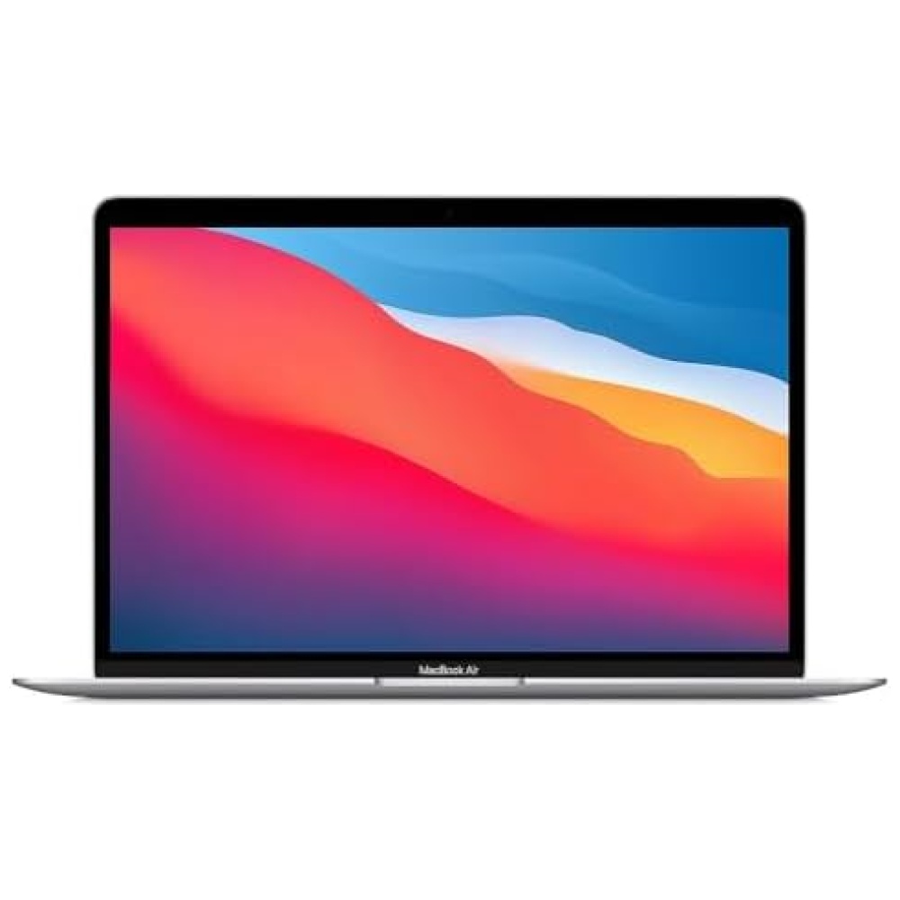
¡Disfruta de una pantalla táctil Full HD IPS de 13,3 pulgadas! Con una resolución de 1920x1080p y un ángulo de visión amplio de 178°, podrás sumergirte en imágenes maravillosas y detalles realistas de películas, videos y programas de TV desde cualquier ángulo. Tus ojos te lo agradecerán.
¡Conexión multipuerto para mayor versatilidad! La BMAX Y13 cuenta con un puerto USB tipo C con todas las funciones, que te permite transferir audio, video y datos. Además, su Wi-Fi 802.11ac con Bluetooth 5.0 te permite conectarte a varios dispositivos al mismo tiempo. Y no podemos olvidar mencionar su mini puerto HDMI, que admite salidas de video de alta definición.
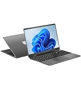
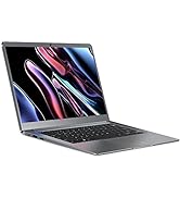
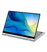
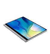
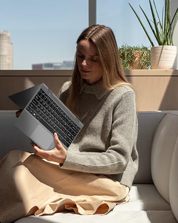
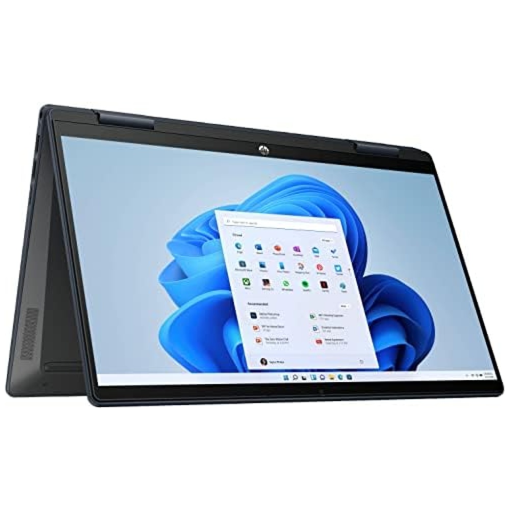
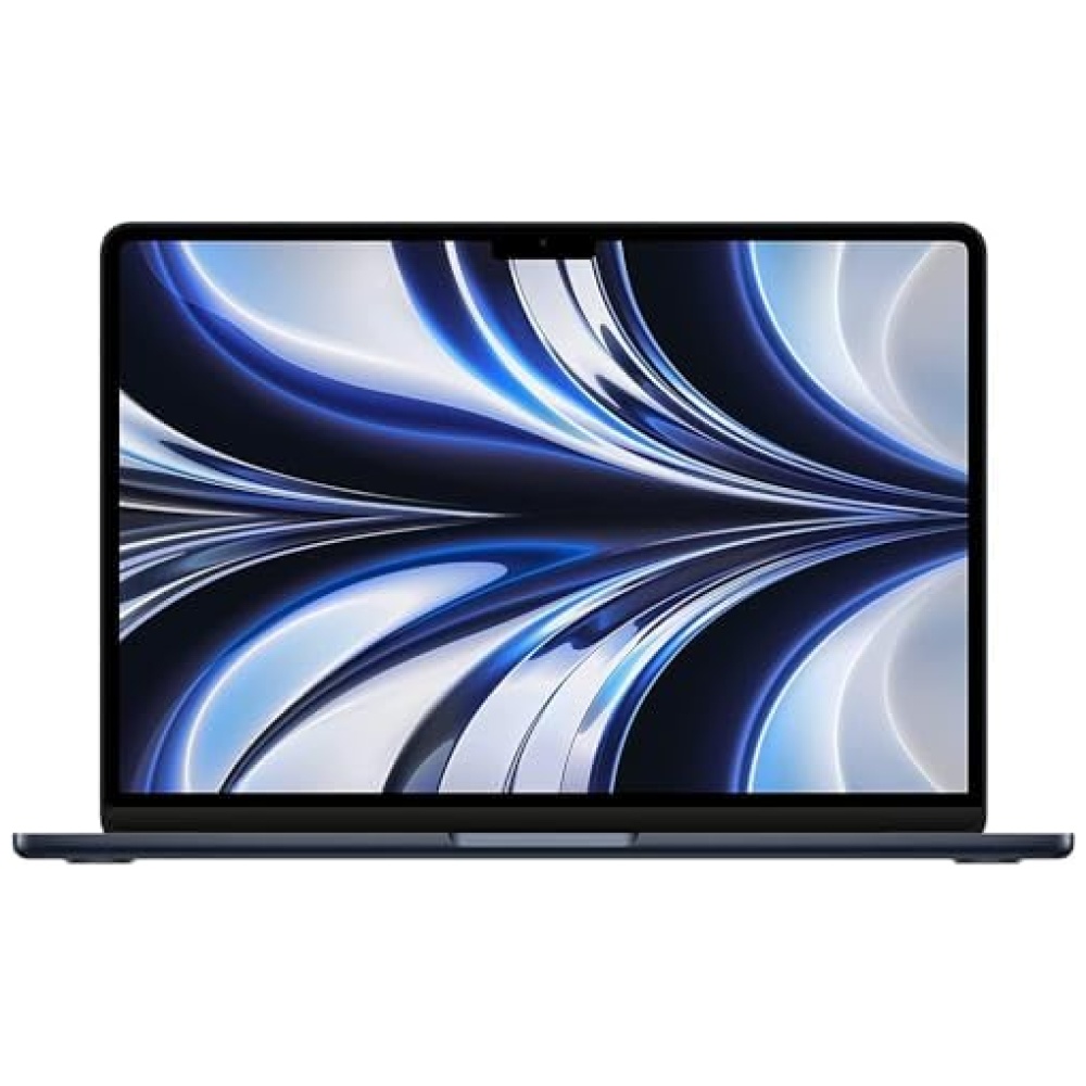
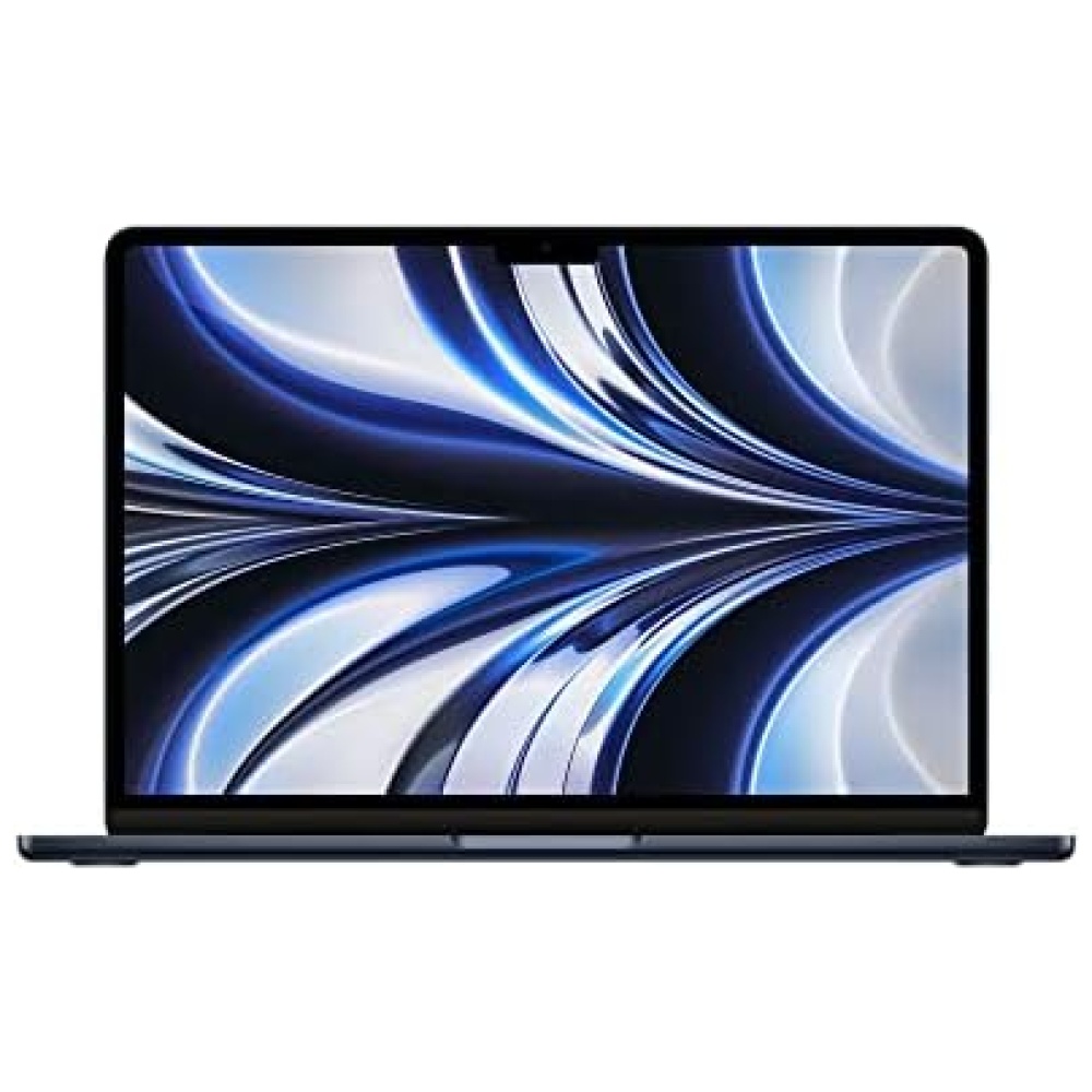
¡Úsala como quieras! Esta computadora portátil convertible de Bitech es delgada, liviana y cuenta con una pantalla táctil. Con un peso de solo 1,25 kg y un cuerpo totalmente metálico de 15 mm de grosor, podrás llevarla contigo a donde quieras. Además, se puede plegar 360 grados y usarla como una tableta. Ya sea que necesites escribir texto mientras viajas, revisar el correo electrónico, actualizar tus redes sociales o disfrutar de música y películas, la BMAX Y13 será tu compañera perfecta tanto para estudiar como para trabajar al aire libre. ¡No esperes más y adquiérela en bitech.es!


En BiTech, ofrecemos , 30 días de Devolución GRATUITA, para que puedas comprar con total tranquilidad. Si no estás satisfecho te devolvemos el dinero. A parte, tienes 3 años de garantía.
Más información
1
¡Operación rápida garantizada! La computadora portátil BMAX Y13 de Bitech es perfecta para manejar múltiples tareas gracias a sus 8 GB de RAM y 256 GB de SSD. Con esta potencia, podrás ejecutar aplicaciones y transferir archivos de manera más rápida que nunca. Además, su inicio es tan rápido que solo tomará unos segundos.
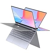
¡Disfruta de una pantalla táctil Full HD IPS de 13,3 pulgadas! Con una resolución de 1920x1080p y un ángulo de visión amplio de 178°, podrás sumergirte en imágenes maravillosas y detalles realistas de películas, videos y programas de TV desde cualquier ángulo. Tus ojos te lo agradecerán.
¡Conexión multipuerto para mayor versatilidad! La BMAX Y13 cuenta con un puerto USB tipo C con todas las funciones, que te permite transferir audio, video y datos. Además, su Wi-Fi 802.11ac con Bluetooth 5.0 te permite conectarte a varios dispositivos al mismo tiempo. Y no podemos olvidar mencionar su mini puerto HDMI, que admite salidas de video de alta definición.
¡Úsala como quieras! Esta computadora portátil convertible de Bitech es delgada, liviana y cuenta con una pantalla táctil. Con un peso de solo 1,25 kg y un cuerpo totalmente metálico de 15 mm de grosor, podrás llevarla contigo a donde quieras. Además, se puede plegar 360 grados y usarla como una tableta. Ya sea que necesites escribir texto mientras viajas, revisar el correo electrónico, actualizar tus redes sociales o disfrutar de música y películas, la BMAX Y13 será tu compañera perfecta tanto para estudiar como para trabajar al aire libre. ¡No esperes más y adquiérela en bitech.es!