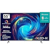
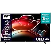
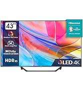
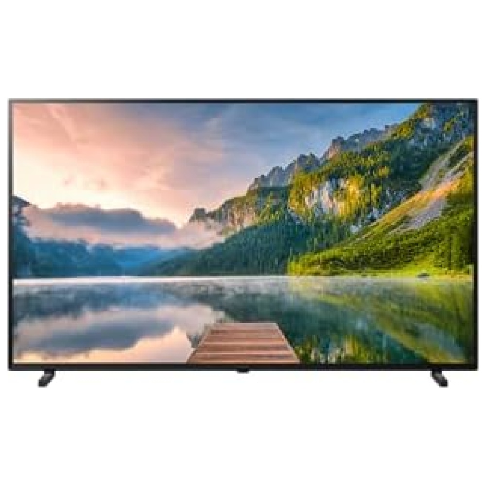
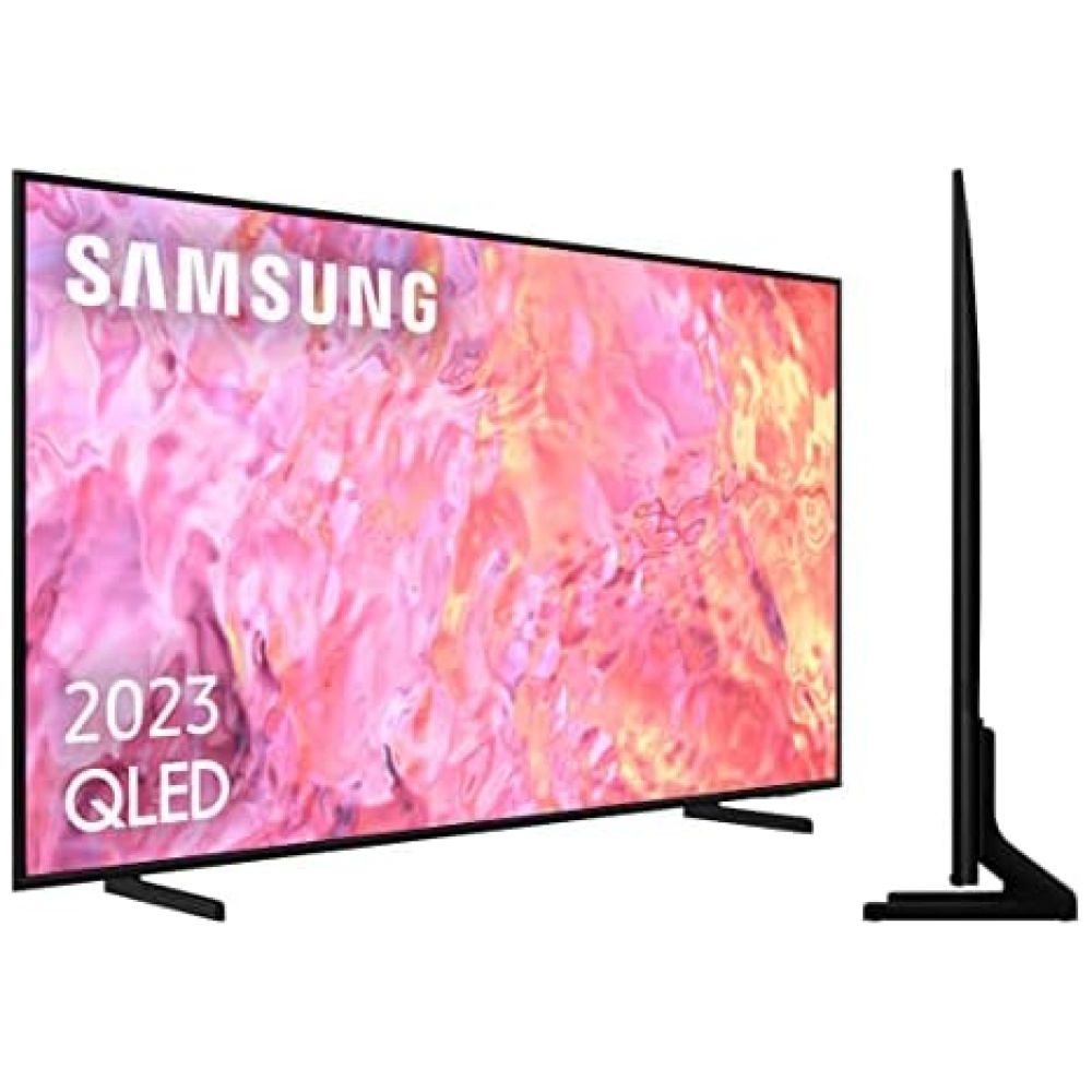
¡Descubre el increíble HISENSE 50A76GQ QLED - Smart TV 50 pulgadas en Bitech.es! Con más de mil millones de tonalidades de color, podrás disfrutar de una experiencia visual realista como nunca antes. Olvídate de que estás mirando una pantalla y sumérgete en una imagen refinada y detallada.
Este televisor cuenta con una calidad de imagen 4K UHD, que es cuatro veces mejor que la resolución Full HD. No te perderás ningún detalle en tus programas favoritos, películas o videojuegos. Además, la tecnología Dolby Vision HDR te ofrece un brillo y contraste mejorados, para una imagen más vibrante y realista.
El Modo Game es perfecto para los amantes de los videojuegos, ya que reduce significativamente el input lag, aumentando tus posibilidades de victoria. Y con Smooth Motion y Sports Mode, disfrutarás de un movimiento limpio y claro, sin vibraciones ni colas.
Accede rápidamente a una gran variedad de contenido y aplicaciones, tanto locales como globales. Además, con Alexa Built-in y Google Assistant integrados, podrás controlar fácilmente tu TV con tu voz. Ajusta la calidad de imagen según tus necesidades y aprovecha al máximo los puertos HDMI, USB y las conexiones WIFI.
El HISENSE 50A76GQ QLED también cuenta con HDMI 2.1, que ofrece soporte ALLM, eRAC y VRR, para una experiencia de entretenimiento aún mejor. Y con el sistema operativo VIDAA U5, acceder a tus contenidos y aplicaciones favoritas es más fácil que nunca.
¡No te pierdas esta oportunidad de tener el mejor televisor en tu hogar! Compra el HISENSE 50A76GQ QLED en Bitech.es y disfruta de una experiencia visual excepcional. Además, con Alexa y Google Assistant, podrás controlar tu TV de forma sencilla y práctica. ¡Hazte con el tuyo ahora mismo!

Calidad e Innovación para tu Hogar


En BiTech, ofrecemos , 30 días de Devolución GRATUITA, para que puedas comprar con total tranquilidad. Si no estás satisfecho te devolvemos el dinero. A parte, tienes 3 años de garantía.
Más información
¡Descubre el increíble HISENSE 50A76GQ QLED - Smart TV 50 pulgadas en Bitech.es! Con más de mil millones de tonalidades de color, podrás disfrutar de una experiencia visual realista como nunca antes. Olvídate de que estás mirando una pantalla y sumérgete en una imagen refinada y detallada.
Este televisor cuenta con una calidad de imagen 4K UHD, que es cuatro veces mejor que la resolución Full HD. No te perderás ningún detalle en tus programas favoritos, películas o videojuegos. Además, la tecnología Dolby Vision HDR te ofrece un brillo y contraste mejorados, para una imagen más vibrante y realista.
El Modo Game es perfecto para los amantes de los videojuegos, ya que reduce significativamente el input lag, aumentando tus posibilidades de victoria. Y con Smooth Motion y Sports Mode, disfrutarás de un movimiento limpio y claro, sin vibraciones ni colas.
Accede rápidamente a una gran variedad de contenido y aplicaciones, tanto locales como globales. Además, con Alexa Built-in y Google Assistant integrados, podrás controlar fácilmente tu TV con tu voz. Ajusta la calidad de imagen según tus necesidades y aprovecha al máximo los puertos HDMI, USB y las conexiones WIFI.
El HISENSE 50A76GQ QLED también cuenta con HDMI 2.1, que ofrece soporte ALLM, eRAC y VRR, para una experiencia de entretenimiento aún mejor. Y con el sistema operativo VIDAA U5, acceder a tus contenidos y aplicaciones favoritas es más fácil que nunca.
¡No te pierdas esta oportunidad de tener el mejor televisor en tu hogar! Compra el HISENSE 50A76GQ QLED en Bitech.es y disfruta de una experiencia visual excepcional. Además, con Alexa y Google Assistant, podrás controlar tu TV de forma sencilla y práctica. ¡Hazte con el tuyo ahora mismo!
Calidad e Innovación para tu Hogar