- Bluetooth Smartwatch Blue")


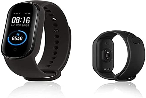
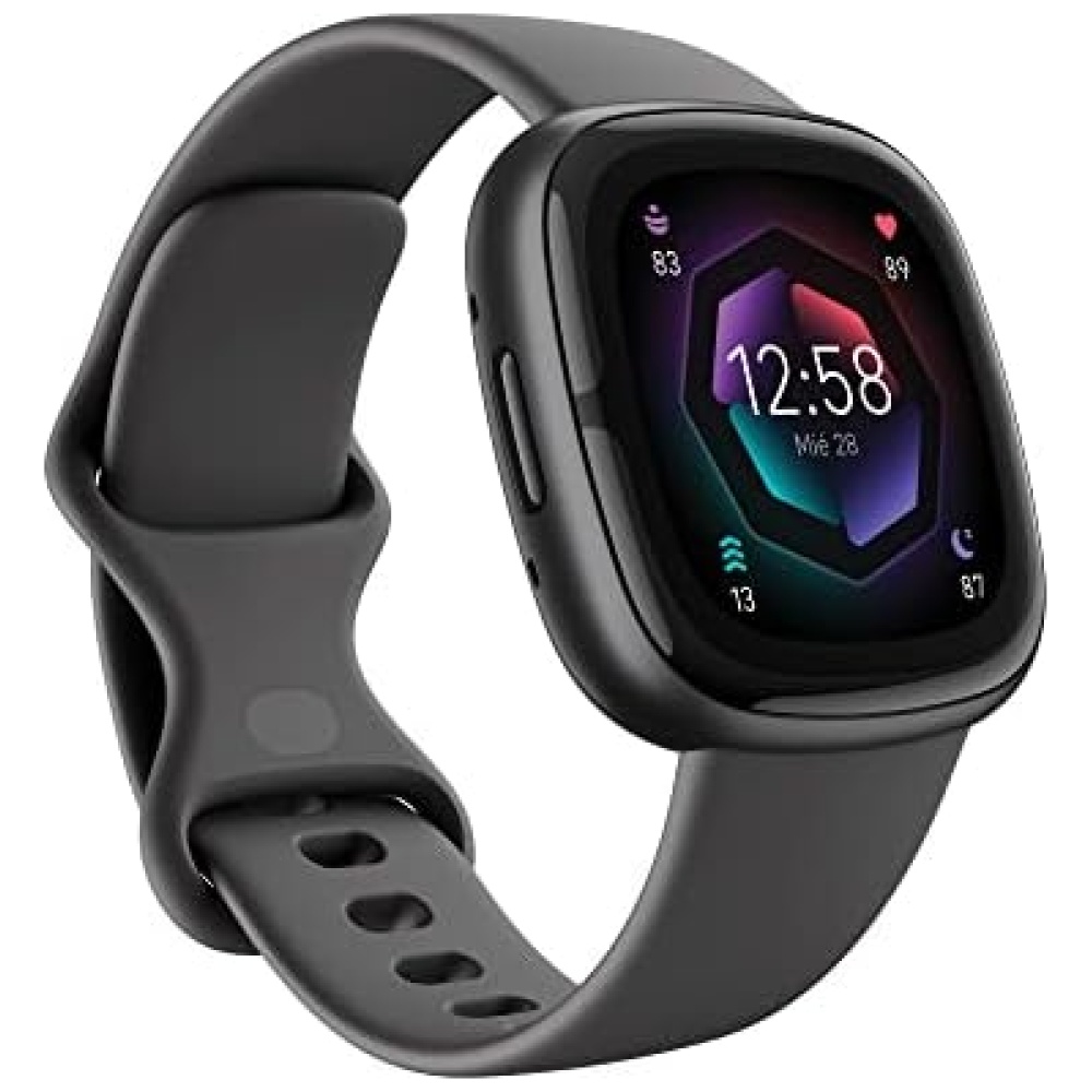
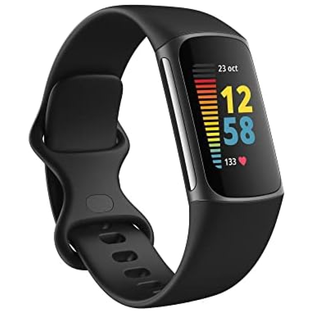
Descubre cómo mejorar tu sueño con nuestra tecnología de análisis del sueño mejorada. En Bitech, te ofrecemos la oportunidad de planificar tu hora de acostarte, detectar los ronquidos y hacer un seguimiento de tus fases de sueño. Además, podrás comprenderlas a través de 8 símbolos de animales que representan tu tipo de sueño. ¡Duerme mejor para disfrutar de días increíbles!
Pilas: 1 Polímero de litio necesaria(s), incluida(s)
Fabricante: Samsung
ASIN: B0B6GHYJGH
Número de modelo del producto: HU-XI-201


En BiTech, ofrecemos , 30 días de Devolución GRATUITA, para que puedas comprar con total tranquilidad. Si no estás satisfecho te devolvemos el dinero. A parte, tienes 3 años de garantía.
Más información
Descubre cómo mejorar tu sueño con nuestra tecnología de análisis del sueño mejorada. En Bitech, te ofrecemos la oportunidad de planificar tu hora de acostarte, detectar los ronquidos y hacer un seguimiento de tus fases de sueño. Además, podrás comprenderlas a través de 8 símbolos de animales que representan tu tipo de sueño. ¡Duerme mejor para disfrutar de días increíbles!
Pilas: 1 Polímero de litio necesaria(s), incluida(s)
Fabricante: Samsung
ASIN: B0B6GHYJGH
Número de modelo del producto: HU-XI-201